Digital Report Platform
For a short time I had the opportunity to work with the creative solutions team. Here they produce native content for external brands wishing to advertise and partner with the Condé Nast Digital publications. I soon realised that the business model was far greater than just designing digital layouts for prestigious clients and this lead me to start my own little side project.
Self Initiated Project, April - August 2016The Brief
After working on many different projects with multiple clients, I quickly became exposed to all stages of the process. One issue was that clients were not returning, and therefore repeat business was minimal. My involvement included producing designs as well as building and testing the final native solutions. However what happened after a campaign went live? Did a client receive any data on the performance of their campaign? How is this data displayed?
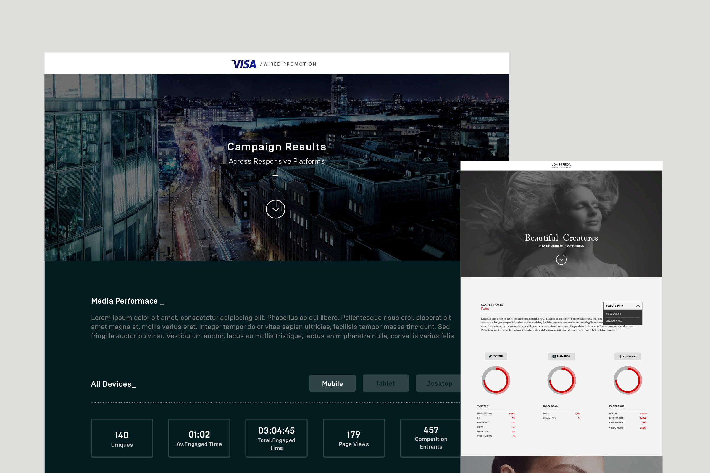
I met with several members of the sales team, and was shown a report that was produced and presented to the client at the end of each large campaign. They explained that each report took someone days to produce, taking data from Google Analytics and putting together a visual report, which they would send to the client as a PDF. I noticed that the reports did not really feel unique to the client or represent the Condé Nast brands. Data was not correctly split into sections; neither did it explain clearly how their campaign had really performed. I noticed that a digital company was providing PDF’s for clients instead of creating a way to share this information through an online platform. Another concern was the time taken to produce each report; I felt that a lot of the process could be automated for greater efficiency.
The Concept
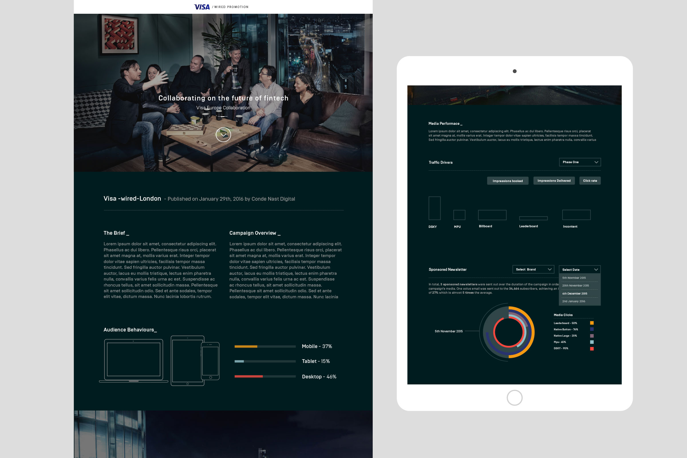
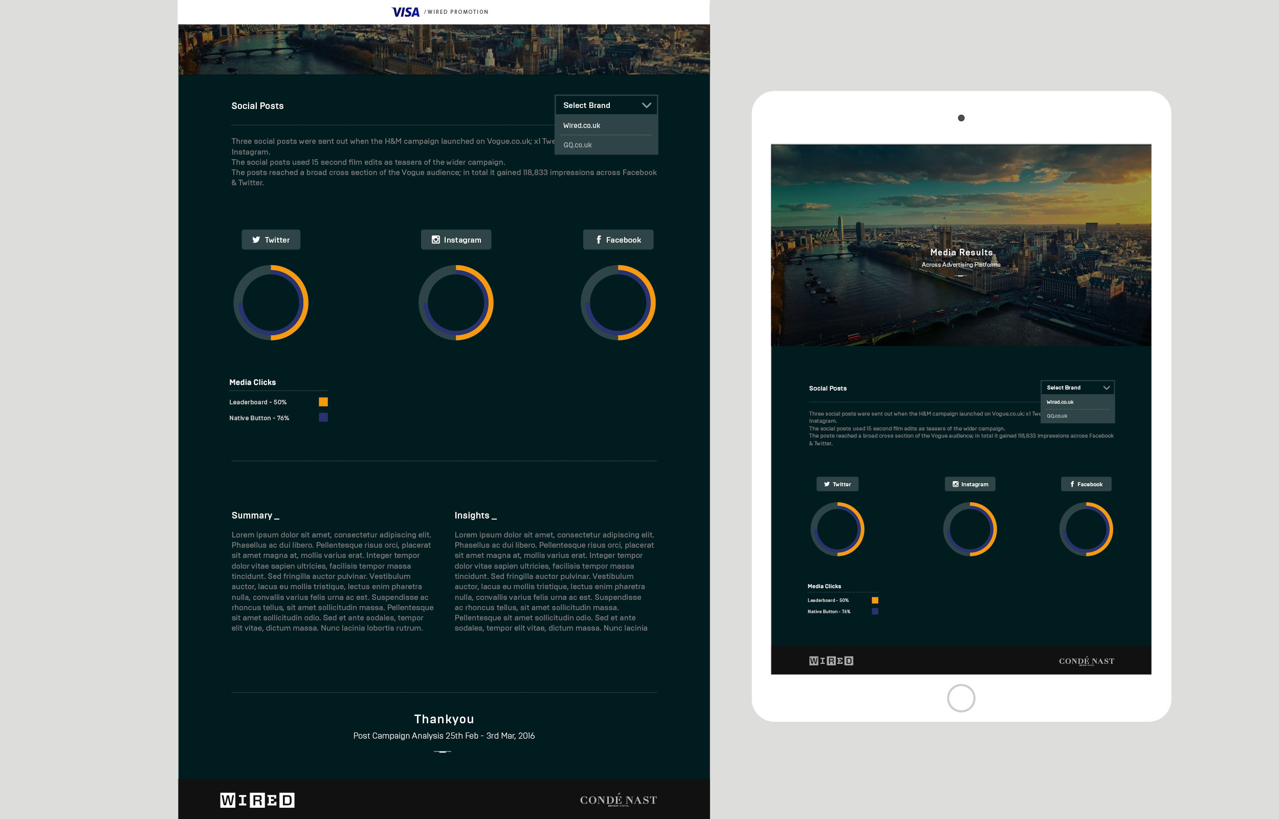
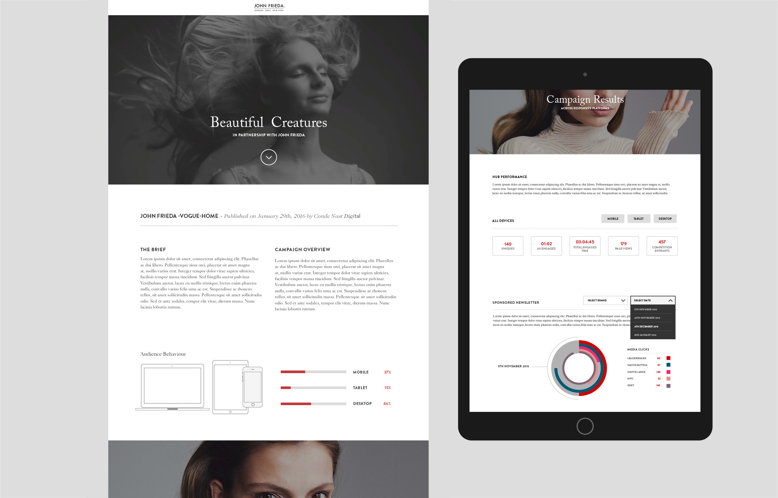
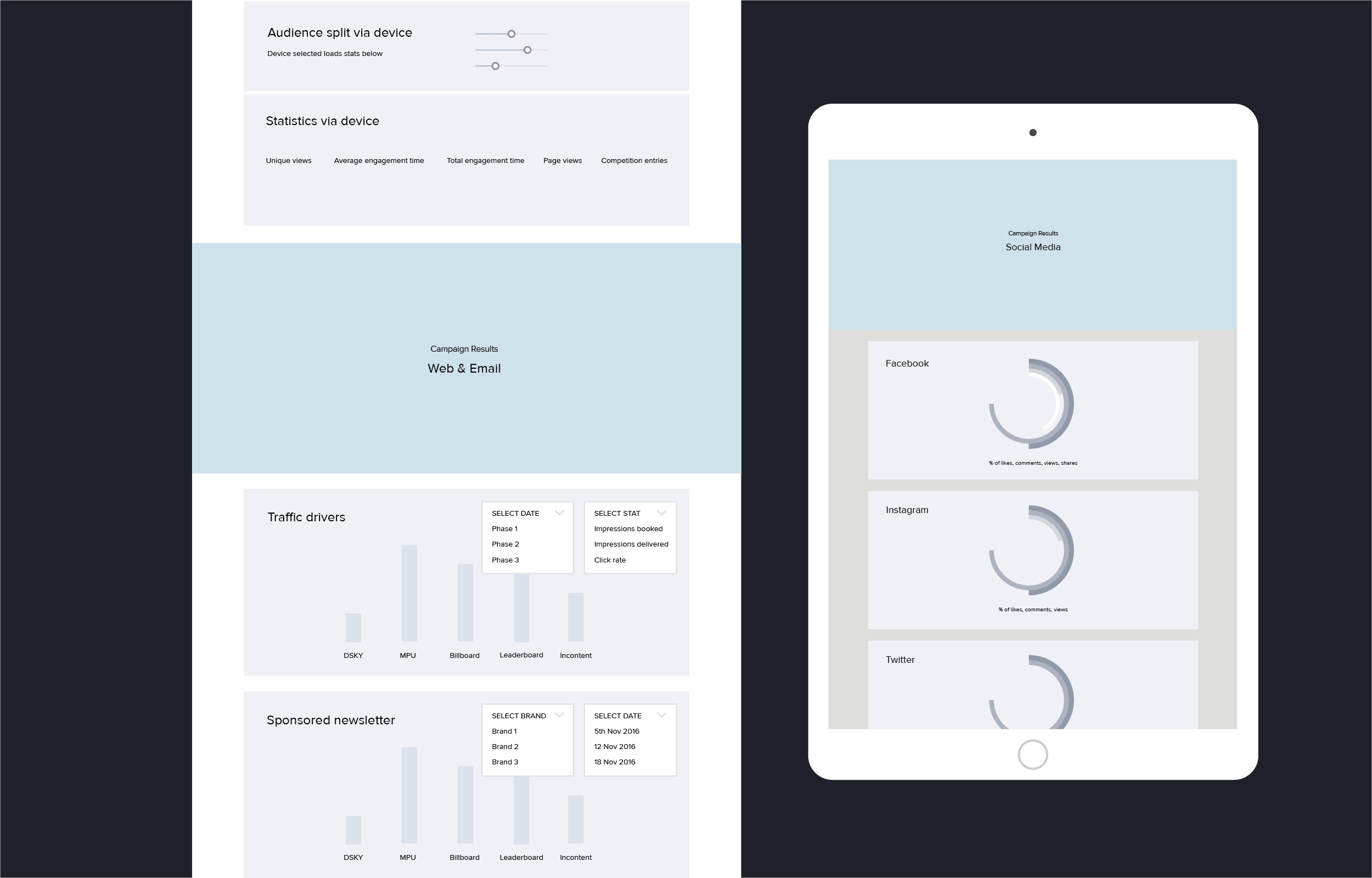
I knew that there were two things that needed to be addressed, the first being visualising the data, and secondly reducing the time it took to produce each presentation. I began by siting with the sales team, compiling a list of data they felt was important to include. Some of this data was existing as well as new. They collected results from Google Analytics and SimpleReach and compiled these into spread sheets. I started by creating a simple template where information could be inserted and updated easily. I wanted to design something that was clean, versatile and could work across multiple brands. Designing this template would serve an initial quick improvement to what was being presented, and when tested did reduce production time by over 50%. However this was only the start, I wanted a client to receive their presentation online which would take more time to produce.
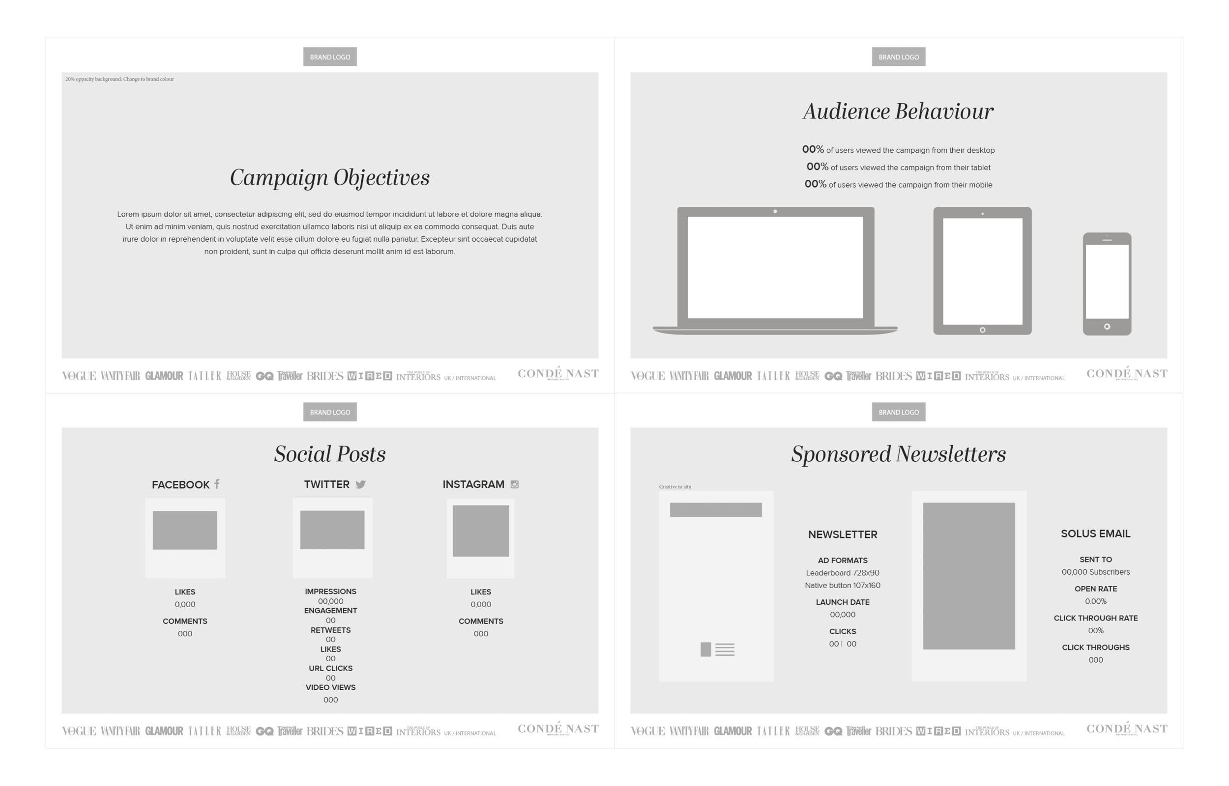
I began looking at some existing data platforms, like SimpleReach and Polar. I was looking for inspiration on how data was visualised, using analytical graphs and charts. I also had a hidden interest for info-graphics, and had enjoyed making my own in the past. The team expressed they wanted to retain a publishing feel to each presentation and include sections for paragraphs, titles and images. I therefore had to come up with a concept that could be edited easily, and was versatile enough. I drafted an initial template; I left room at the top for an introductory image and space to include the brands logo, as well as creating different sections.
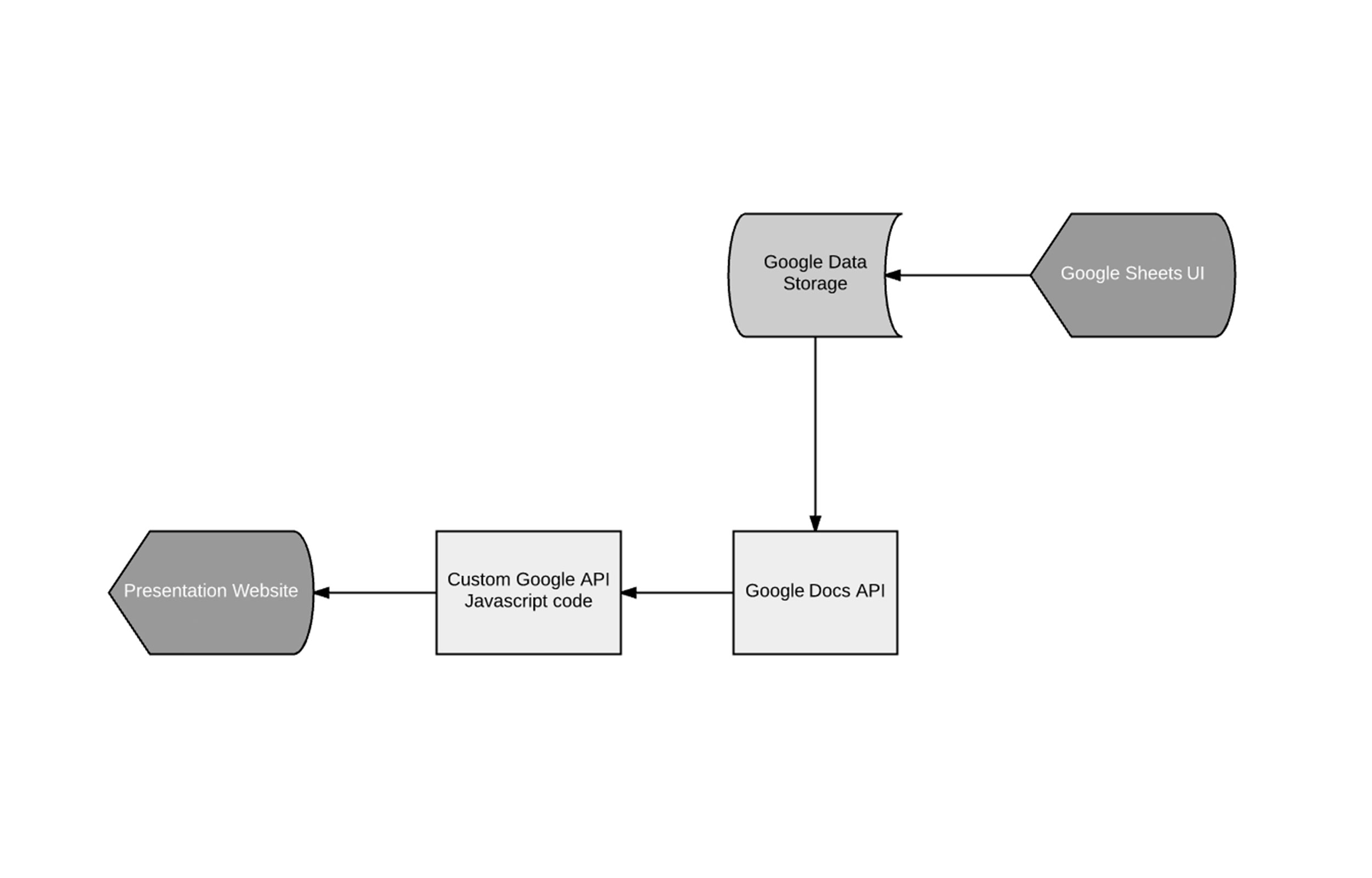
The team had expressed how time consuming it was to collect results from each Spreadsheet and compile this into every presentation. What if there was an easier solution? What if my online template could update automatically as data was added, or changed?
With the help of the team’s developer we came up with a different solution. I had a list of data complied from a campaign that I had previously worked on. This data was collected from various analytics software into a Google Docs Spreadsheet. We then used the Google Docs API to extract the data and feed it into the web analytics page. The client side java script pols the Google Docs API at regular intervals so that any changes in the underlying data are displayed in near real time. This concept automated what was previously a very lengthy process.