LUMO - App Only Energy Tariff
From initial price comparison site to app only energy tariff, Lumo has evolved from a small customer facing website, to a fully native app. As Lead Designer on the Lumo team, I was involved in all aspects of the products journey. This study explores insights into my design process from initial research and testing, right through to the live product.
Live Piece, Nov 2016 – Dec 2018ABOUT LUMO
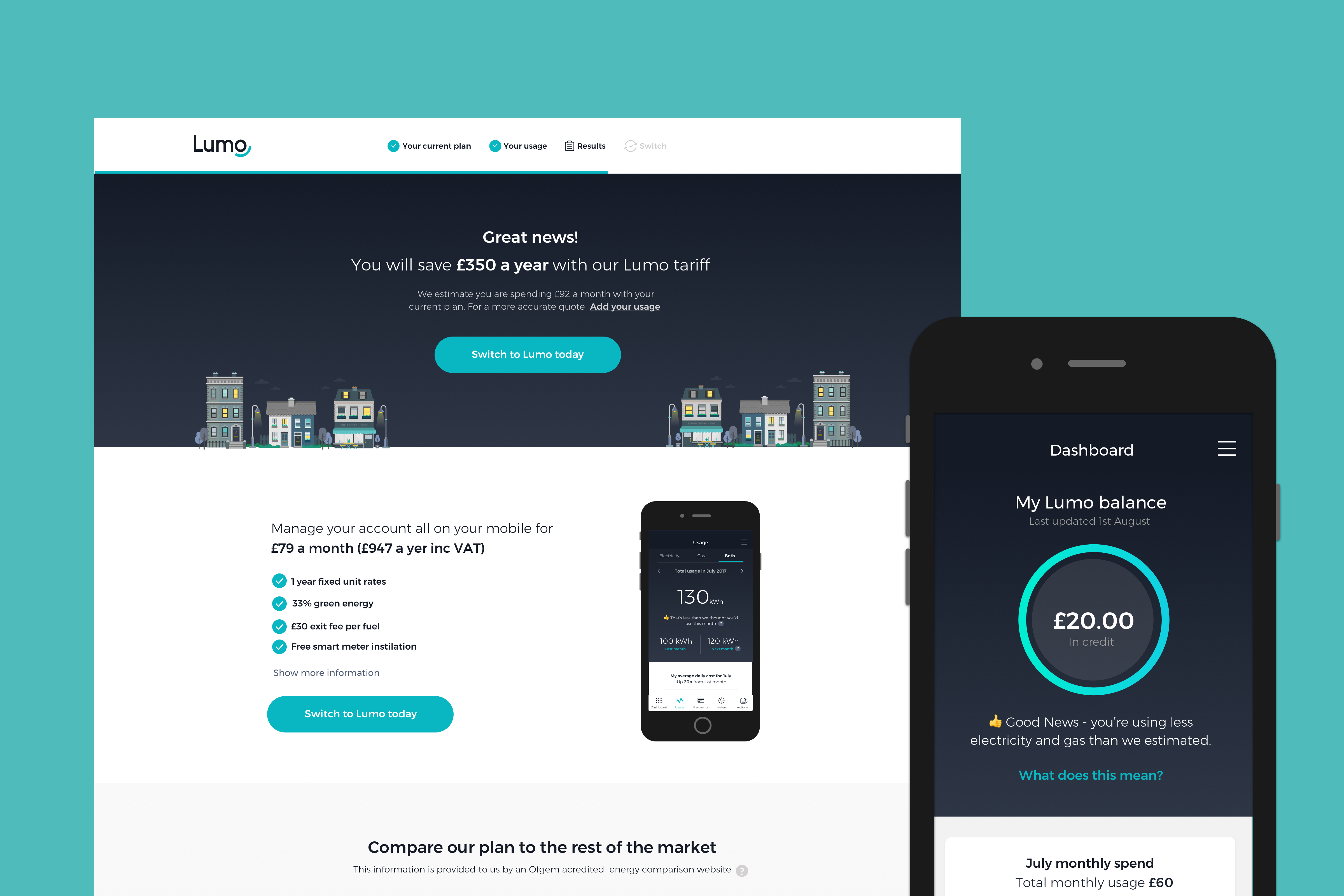
When joining the Lumo team, the business focused on providing customers with a comparison platform, where they could switch to the best energy provider for them. The user journey involved a sign up process, a series of onboarding questions about their home and existing energy supplier, as well as the option to scan or upload their latest energy bill and usage amount. The comparison results allowed for a user to filter by either price, customer rating or greenest supplier. As the business grew, Lumo’s focus moved towards becoming an energy supplier, rather than a platform for comparing other suppliers. The focus was on providing an app only service, and therefore a lower cost to serve product.
Research & Testing
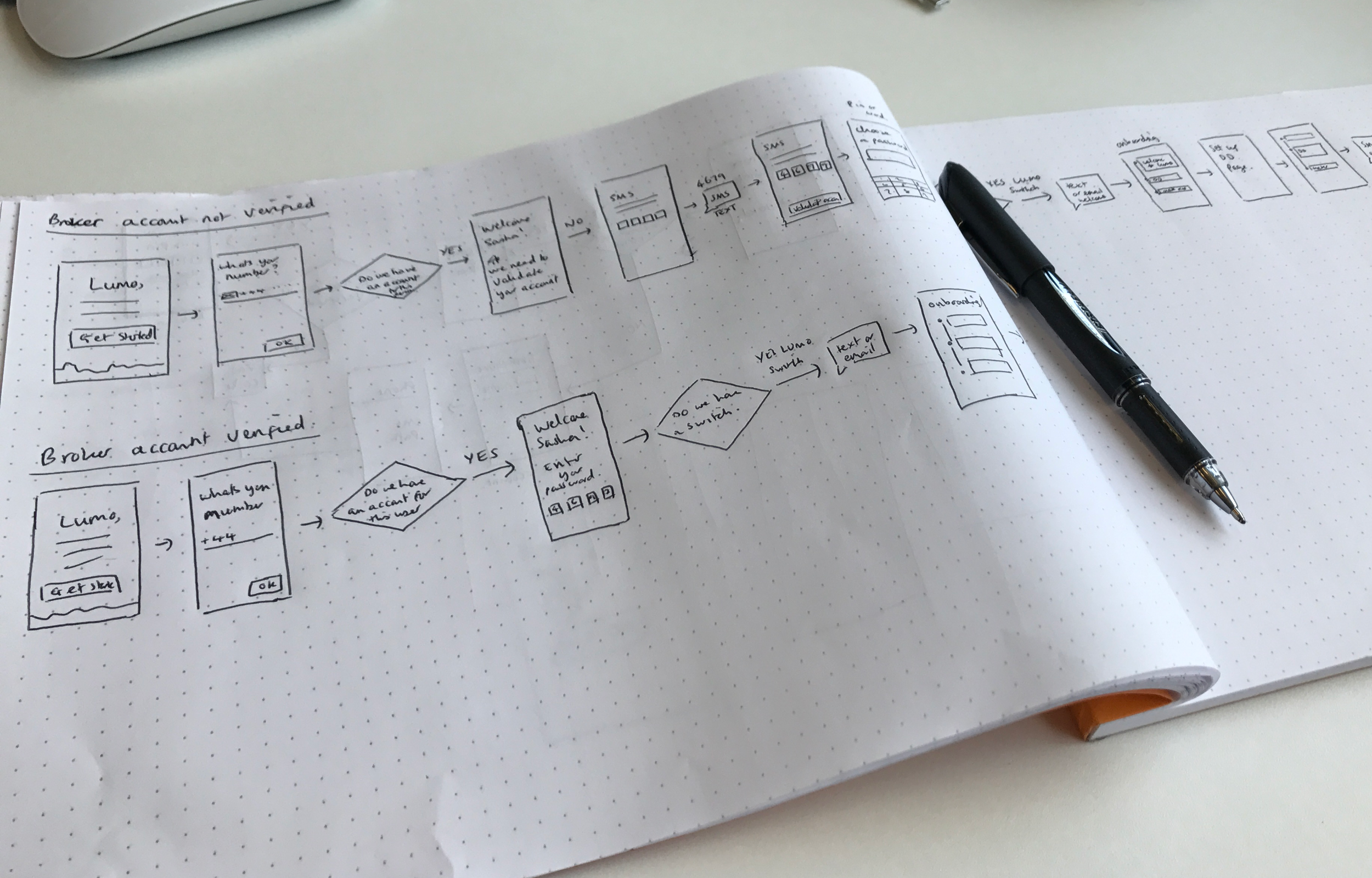
Our approach to UX was very much build, measure, learn. In the early stages we would learn about our user needs by sending out surveys. This allowed us to easily expand on our assumptions, and further understand what we believed our personas goals were. As we began testing we were able to validate these assumptions and identify the various pain points and difficulties found in certain journeys. Through a series of user testing workshops one of the main pain points was accuracy of usage data and how this was displayed to the user. The onboarding journey for creating an account using the app and later inputting meter readings, also required testing various ideas. When testing each concept with users it was important for us to consider ideas not only from a user experience perspective but with technical and business goals in mind. Initially we created two personas, whom we believe best represented our main user base.
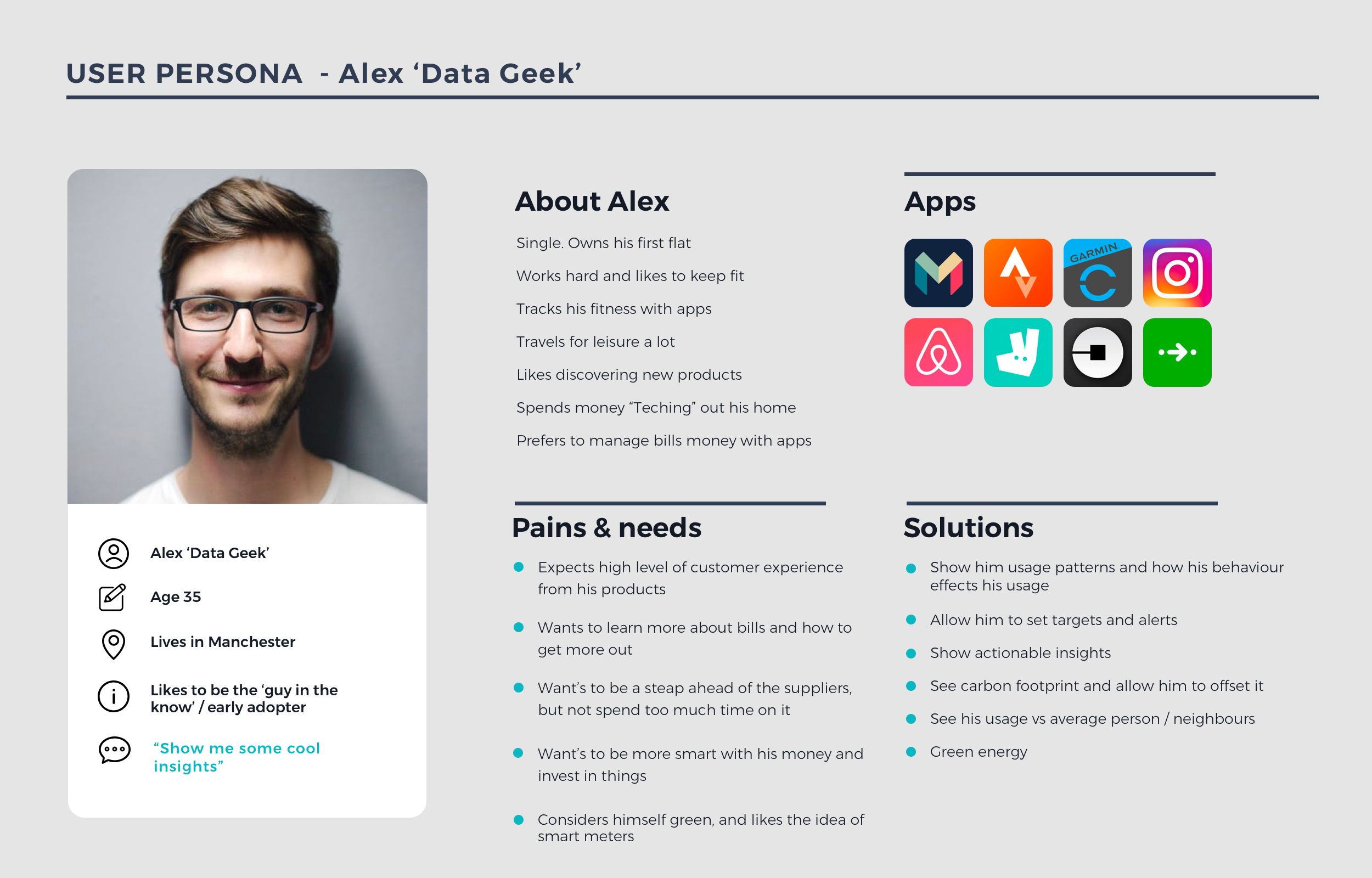
Alex 'Data Geek'
Alex is looking for a product that is data driven and discoverable. He is always the guy in the know and uses the app to monitor his usage efficiently. He would like to explore the app, going deeper into his data to discover how appliances in his home could affect his usage, or by looking at the amount of energy he uses compared with his neighbours.
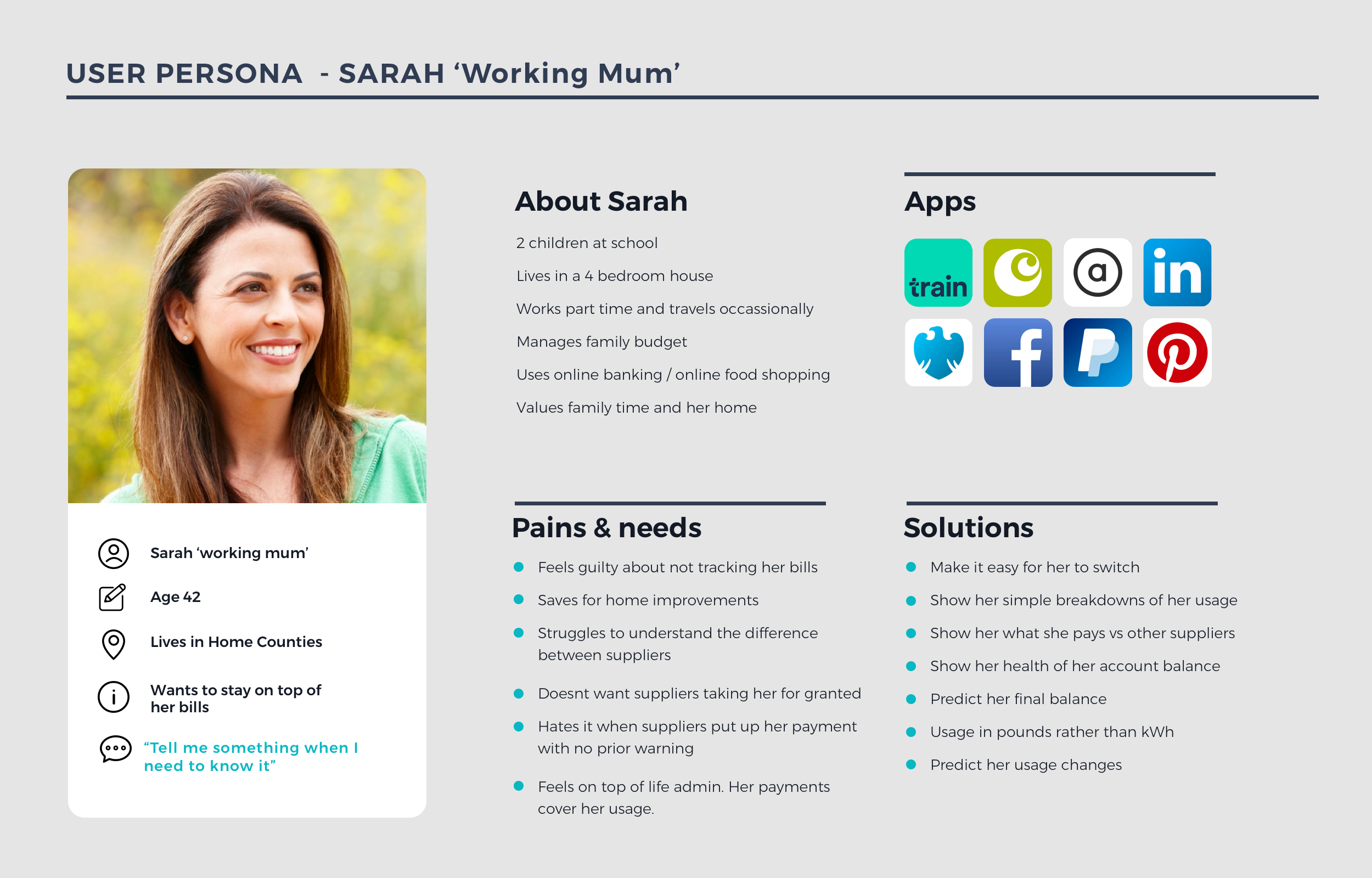
Sarah, Working Mum
Sarah likes to be lead through the process of submitting her energy usage. She is less informed on the energy market, and would like a service that allows her to keep on top of her bills, freeing up time to focus on the other areas of her life. She is a busy mum often completing household admin on her way to work. She likes products that allow her to find what she is looking for easily and all in one place.
As the product evolved and we began speaking and testing with Lumo's live users, we realised that Lumo also had another main user, who was more focused on price, and wanted to switch the cheapest tariff.
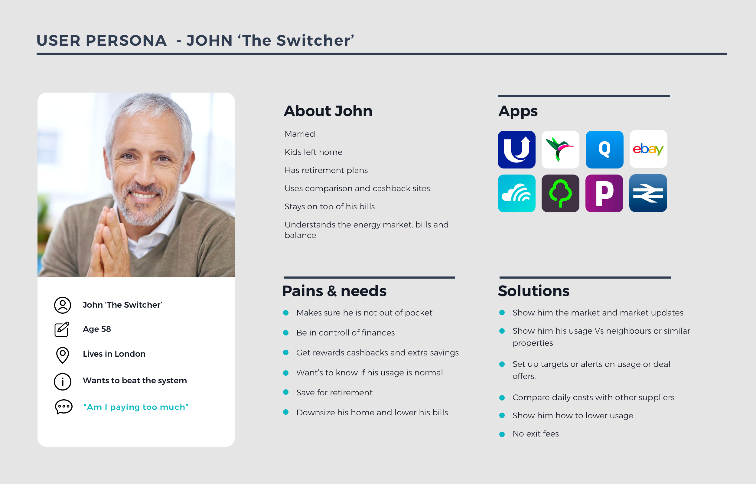
John, The Switcher
John is very knowledgeable about the energy market and understands his usage. He is focused on always being on the best energy tariff even if this means switching suppliers multiple times per year. He uses sites to compare offers through money saving websites like Top cashback. He engages with Lumo to check his energy usage is correct, manage his bills but also to be notified when it is time to switch to a more price effective tariff.
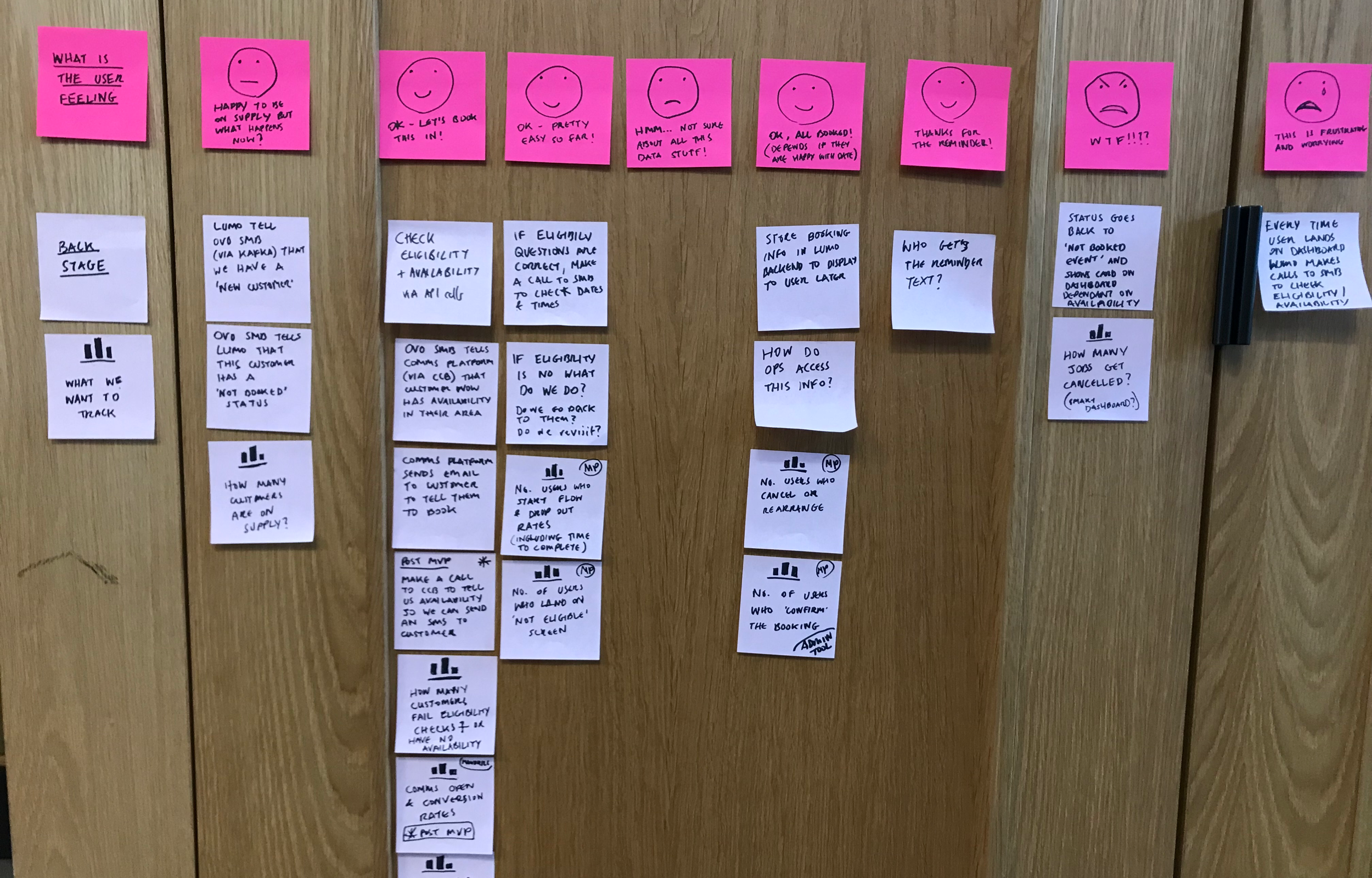
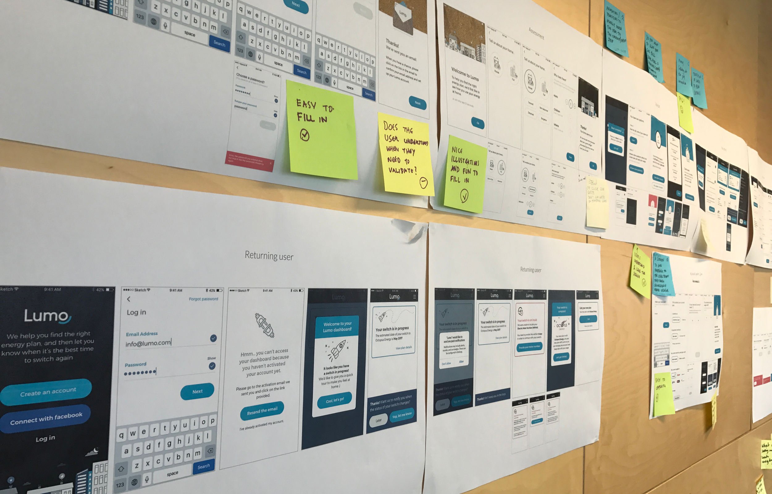
Each major feature was tested, either as a team through a series of workshops, or by inviting users in for product testing. We faced a lot of challenges along the way, specifically when onboarding customers through the sign up process. Due to the nature of the product, we would often need specific details about the user's home and more importantly their actual usage from the offset, in order to provide accurate results in both the comparison table, and for accurate billing. Of course this information was not always supplied accurately and would therefore affect their first bill.
Being an app only product, it was critical that we asked users to turn on app notifications. At first we would ask this question as soon as the user had completed the sign up process, but before revealing any comparison results. After testing this idea, we found that many users declined, as their focus was purely on seeing their results. We thought long and hard about when to ask this question, and we soon realised that it was best placed somewhere they might need a reminder, ie, after submitting their first reading - as a subtle reminder to submit the next, or after booking a smart meter appointment - to be notified the day before the engineer was due to arrive at their property.
The research highlighted that it was important to engage with the user by explaining why something is important and a benefit to them and not asking too much to soon, so that trust in the product could be built. Being able to communicate with our users, whether through email, text or via the app, was vital. Unlike other apps where engagement may be on a daily basis, for example through social media, news or even banking apps, energy related admin, is completed less often, meaning that a user could go a long time without needing to engage with the app at all. Engagement levels were therefore low, making communication an even greater challenge.
OUR EXPERIENCE PRINCIPLES
We wanted to create a product that was zero effort for the user, where they felt in control and empowered by their choices, and where they had trust in the service we provided. Here are some examples of our principles, and what defines each one.
Zero effort
Make it easy for our customers to self serve and manage their account in the app.
Examples: You can change and edit contact details or payment date. We’ll simplify complex processes like opening meter reads, switching, and booking a smart meter by supporting you and giving you timely updates.
Feel in control and empowered
Give users the right information at the right time to make better decisions.
Examples: We’ll remind you about meter readings, give regular updates on your balance and usage behaviour, so you can control your energy finances with all the information at your fingertips. We’ll use friendly, simple language to guide and support you every step of the way.
Transparent and trustworthy
Keeping customers informed on the energy market.
Examples: We’ll show you the whole market, so if there’s a better deal out there, we’ll help you switch and let you carry on using the Lumo platform. We’ll help you understand how quotes work and help you get the most accurate quote, not the quickest.
CHALLENGES & SOLUTIONS
As with any digital product, there are always challenges to overcome. Solving complex problems is one of the most rewarding parts of any design process. Through extensive research we knew our users came to the app for three main reasons. To submit a reading, check their usage and view or download their monthly bill amount. Each of these areas, required different features, challenges and a variety of solutions.
Defining Usage and Displaying Data
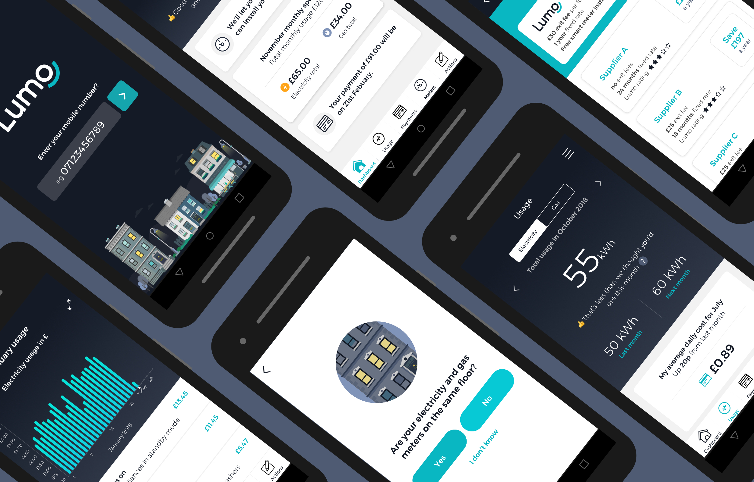
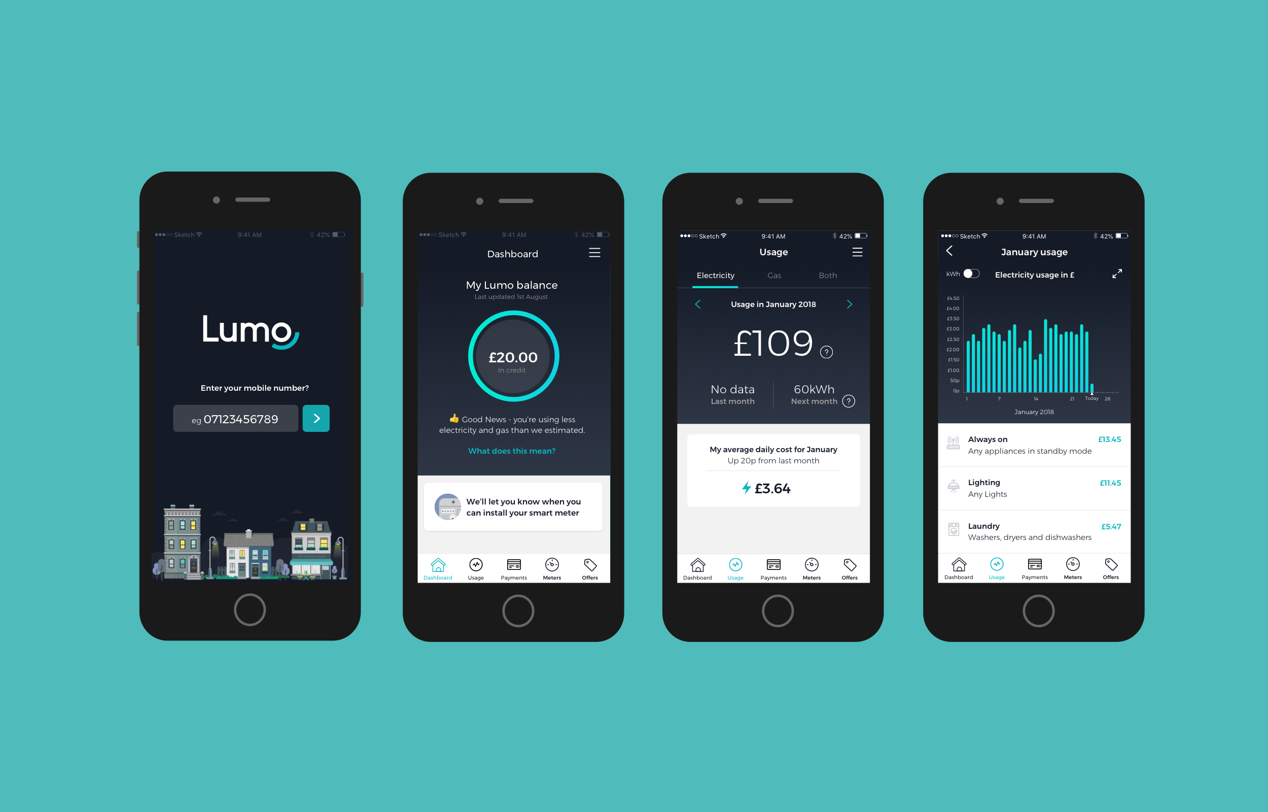
Defining how we displayed energy usage was an ongoing process. At the start we made many assumptions, that a user would of course like to see graphs and charts showing how much energy they had consumed that month. We did a lot of competitor analysis, looking at how other apps such as Bulb, Eon, and British Gas display their usage. Charts and graphs were a common theme amongst most, showing the user monthly usage against a yearly average. As usage in the Lumo app was displayed as a monthly amount, we also researched into apps that take a similar approach to displaying data in this way. Banking, fitness and mobile contract apps all give insights into this type of measurable data. Whether this was displayed in pounds, minutes, kwh, miles, kg and so on, it was all relative in helping us reach our starting point. Once a user was able to apply for a smart meter, their daily usage amount, as well as monthly and yearly would need to be displayed, so we needed a solution that was flexible. As well as looking at the data values, we also wanted to test how it was displayed. We experimented with both dark and lightmode, as a concept for showing usage, and whether dark mode was better suited to breaking up the app into two visual paths. During our first round of testing, we asked users how they expected to see their energy usage, before taking them through a couple of prototypes. We wanted to ask open ended questions, rather than guiding them towards a set of ideas too early on. Many users expected the app to show them usage graphs, but also said that whilst they looked nice, they were hard to understand. Primarily they just wanted to know their usage amount in pounds rather than kwh, and for this to be displayed in a way that was easy to obtain. Showing usage values in pounds proved a familiar concept to most - they roughly knew how much they spent on average per month for their energy, and would therefore know if they had consumed too much or needed to switch to a cheaper supplier. Our business goals were always to give users the most accurate representation of their energy consumption, but also help them switch to a cheaper supplier at the end of their supply contract.
Understanding Payments and Billing
One of the greatest challenges when building the product features was making sure it was clear and easy for users to self serve. Unlike other services, Lumo was app only, so for tasks such as adjusting their payment amounts, this was something that they would need to do themselves in the app. We wanted to give users the right level of flexibility, so they were able to make their own decisions, but in a way that was responsible and considered. In the early stages of the apps development, we would send out reminders to customer that needed to either make payments or increase their payment amount. Feedback from users suggested that they were often unclear as to why their payments did not cover their usage, or in some cases that they were in fact overpaying. Another challenge was describing the term average usage, rather than defining a set monetary value. Their average usage value was based over a 12 month period, which proved hard to explain to a user who’s primarily focused on monthly values. This would mean that whilst bills were generally higher during winter months, the reduction in energy consumption during the summer months would reduce the total average for the year. One idea we tested was a traffic light system. If a user was on track with their yearly average and their monthly payments covered this it was displayed as green. Amber suggested that they would need to increase their payments and red that their current payments did not cover their energy consumption. Most users found this system helpful. Visually the colour coding of a traffic light system was easily relatable, and any additional information describing each section, provided reassurance. This information was clearly displayed on the apps dashboard as well as in the billing section. If an action was required by the user, our primary buttons would take them to the relevant area of the app to complete this.
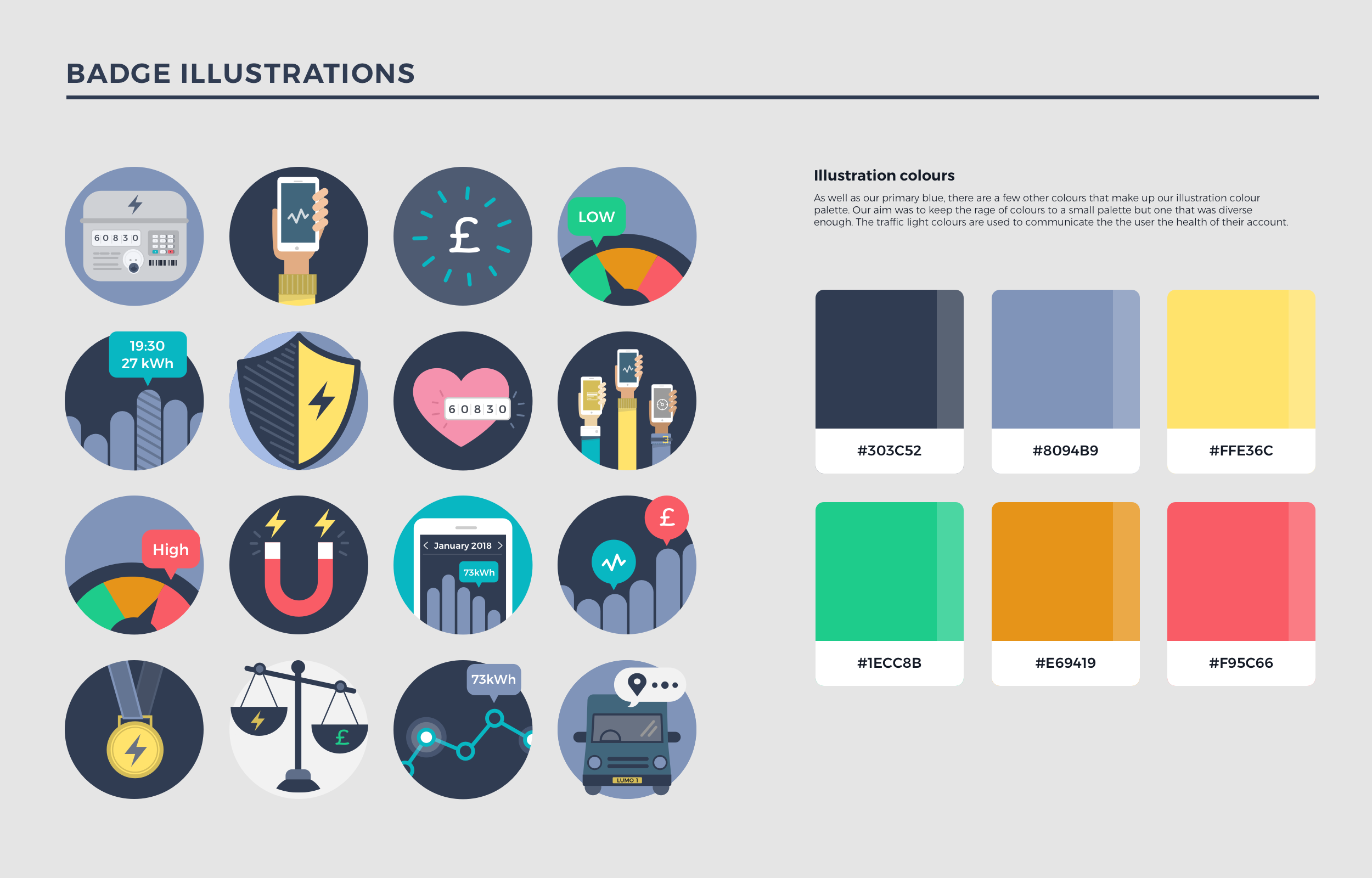