How I designed the wired uk homepage
With the recent update of the article page, our focus moved to the re-design of the homepage. I was working as part of a small team of developers and Information architects. My involvement was vast, from mocking up concepts at the very beginning, right up to finessing the CSS for each iteration. Here is a case study into my design process and thinking behind the final outcome.
Live Piece,
August 2014
Why make a change at all?
With Wired.co.uk users being largely desktop, we wanted to focus our attention on making this experience better. When we looked at how users were using the current homepage we noticed that they mostly focused on the stream of news, and often kept scrolling, choosing articles down the stream. Our early concepts centred around a few discussions, of curated vs automated. Should every article be listed on the homepage, or should the editors choose? We soon realised that not all stories were equal in terms of time-relevance, content-type and interest. This lead us to the concept of a stream of stories, that could be ordered differently, with some adopting fixed positions based on popularity, and larger magazine features.
The Concept
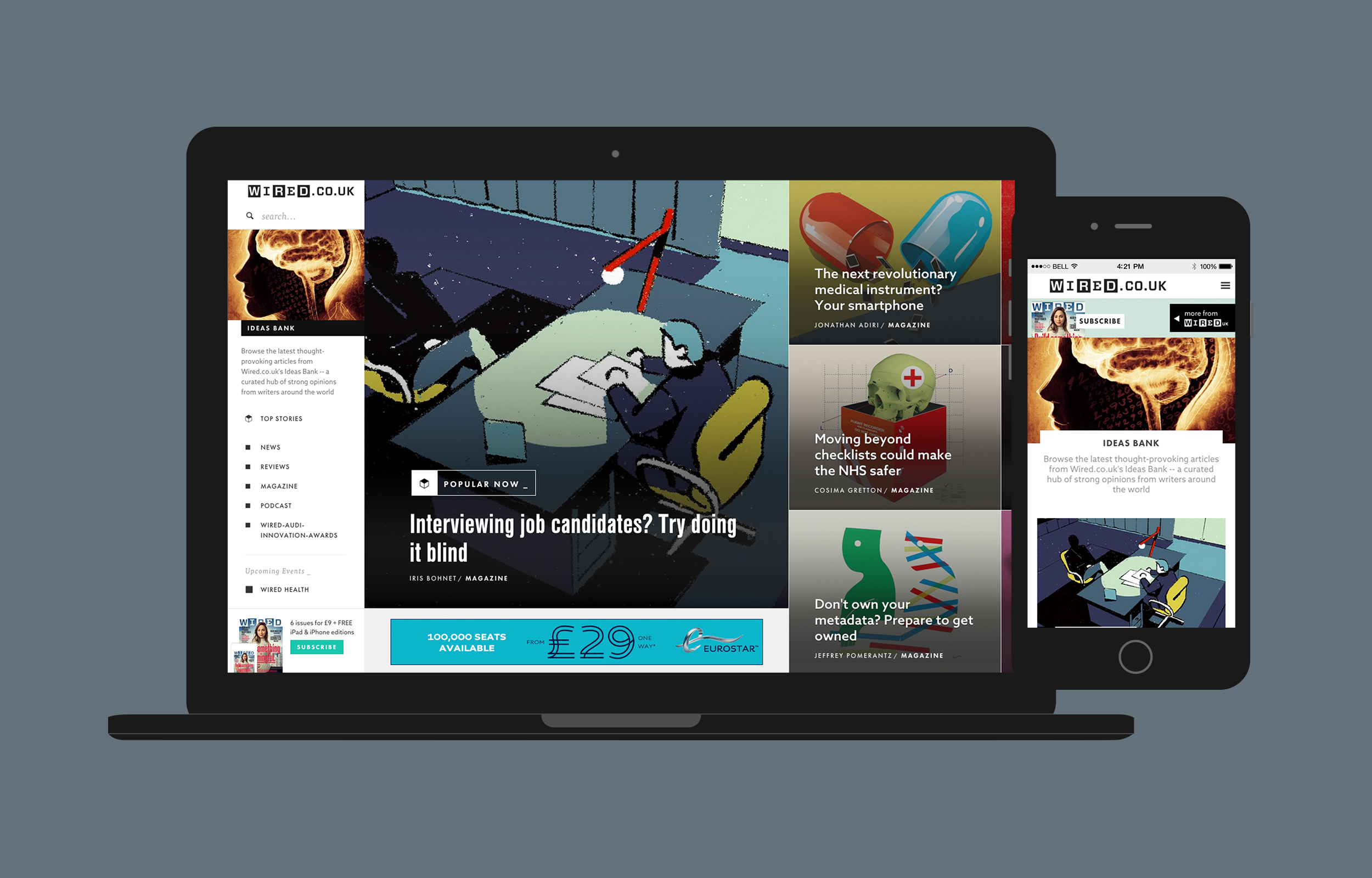
We wanted the new timeline concept to feature all articles not just news, and feature those items based on measurable metrics. We also wanted to allow manually featured items that would be interspersed periodically within the timeline. I began by making wireframes, and conceptual designs, working closely with the information architect to make sure I was capturing the data and findings correctly. It was important to the team that users felt confident that they knew where they were compared to their previous visit. The articles themselves would have a hierarchy of layout or style to show differences between timeline-based choices and the different levels of ‘Featured’ an article could be.
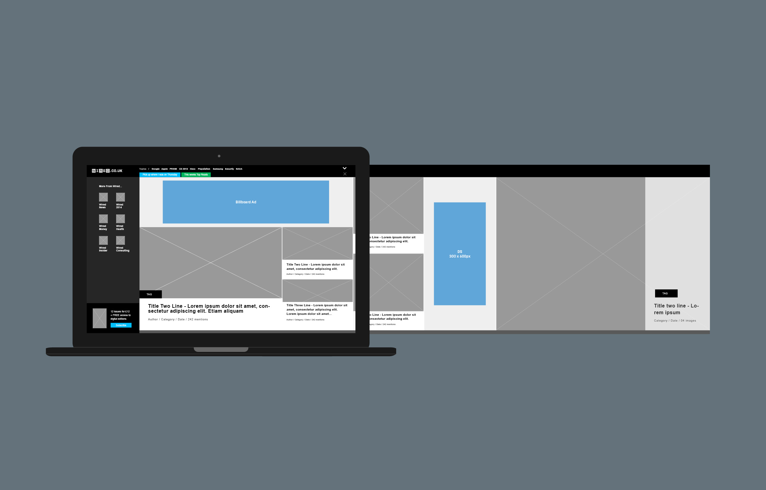
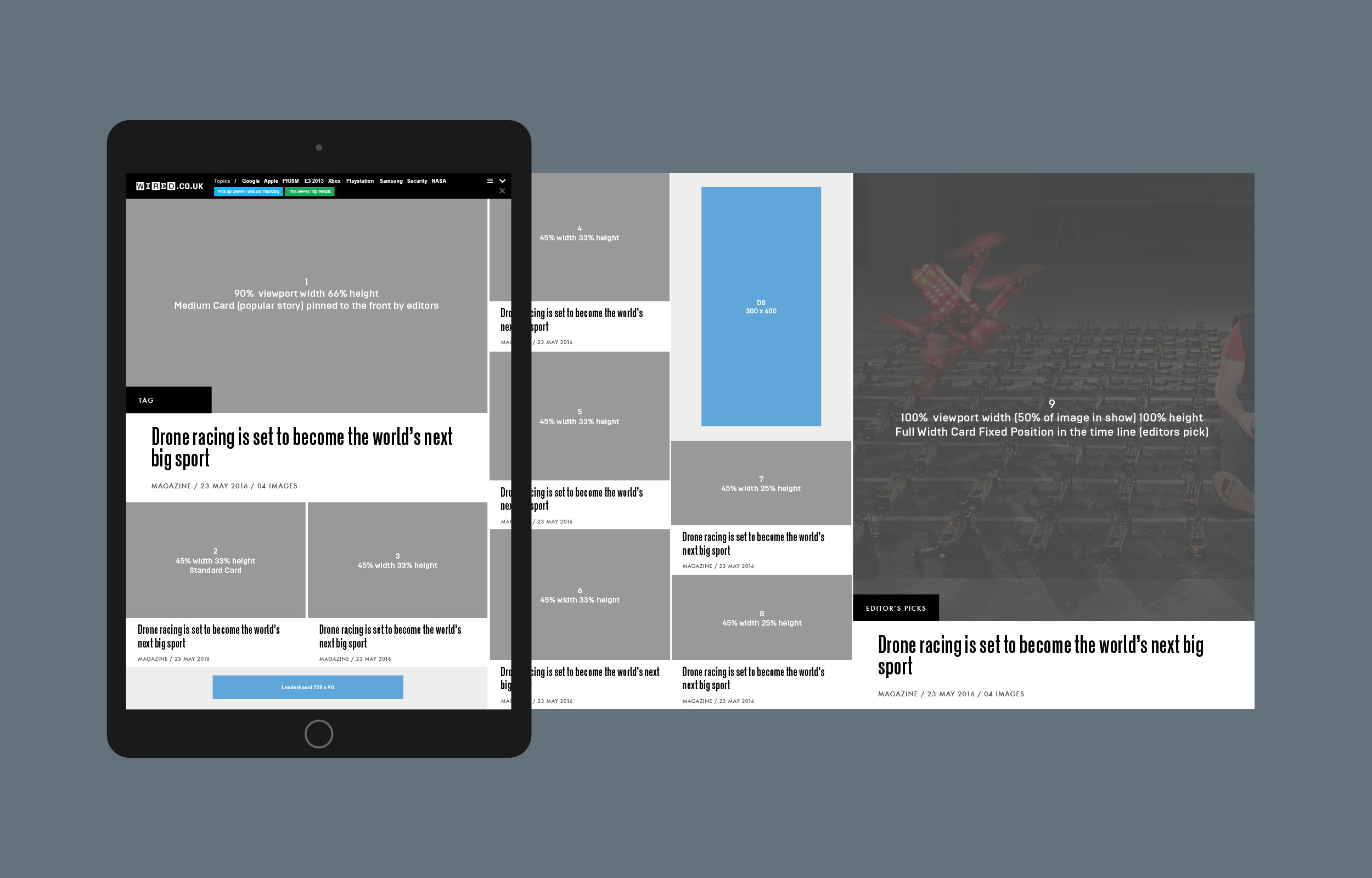
wireframes & styles
Wireframes to show the layout of the homepage sections, calculating in percentages the height of each element. Ads were included to show how this affected the height of content positioned directly above and below.
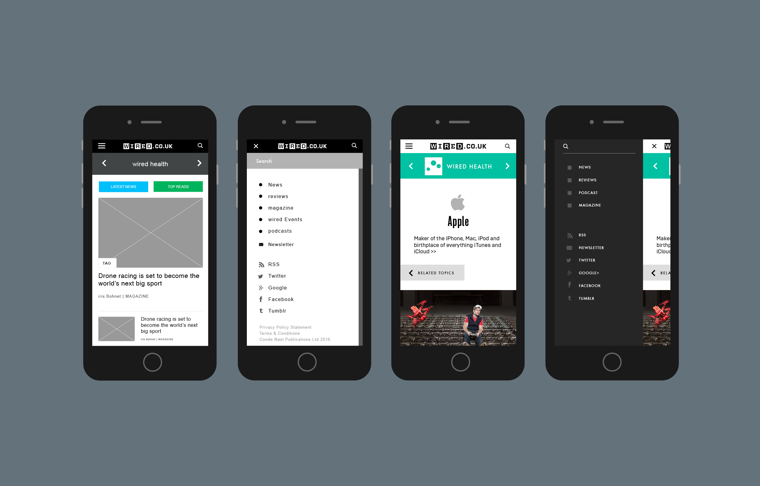
Mobile Navigation
We wanted the mobile navigation to function in a similar way to desktop, sliding across from the left.
Testing
Before even attempting any visual designs, it was important to establish the hierarchy of elements. With the team swaying towards a horizontal scrolling website where a variety of differently sized cards sat closely together, it relied on information being very tightly packed. It was important for me to decide what was the hierarchical importance for each article within a content stream of its elements: image, title, category, author and date. The idea of the test was to see how a users opinion on a story changed depending on the information in front of them. I created a series of cards, showing different combinations, of how the elements could be displayed. Using this information, I was able to make a very early mock-up, which we prototyped allowing us to test with real data. We then began to look more in-depth into a users journey based on the prototype we had made using usertesting.com. Users were asked a variety of questions, from finding certain elements on the page easily, to their thoughts on usability and visual design. From this we knew we were on the right path and I could now look more in-depth at the visual designs.
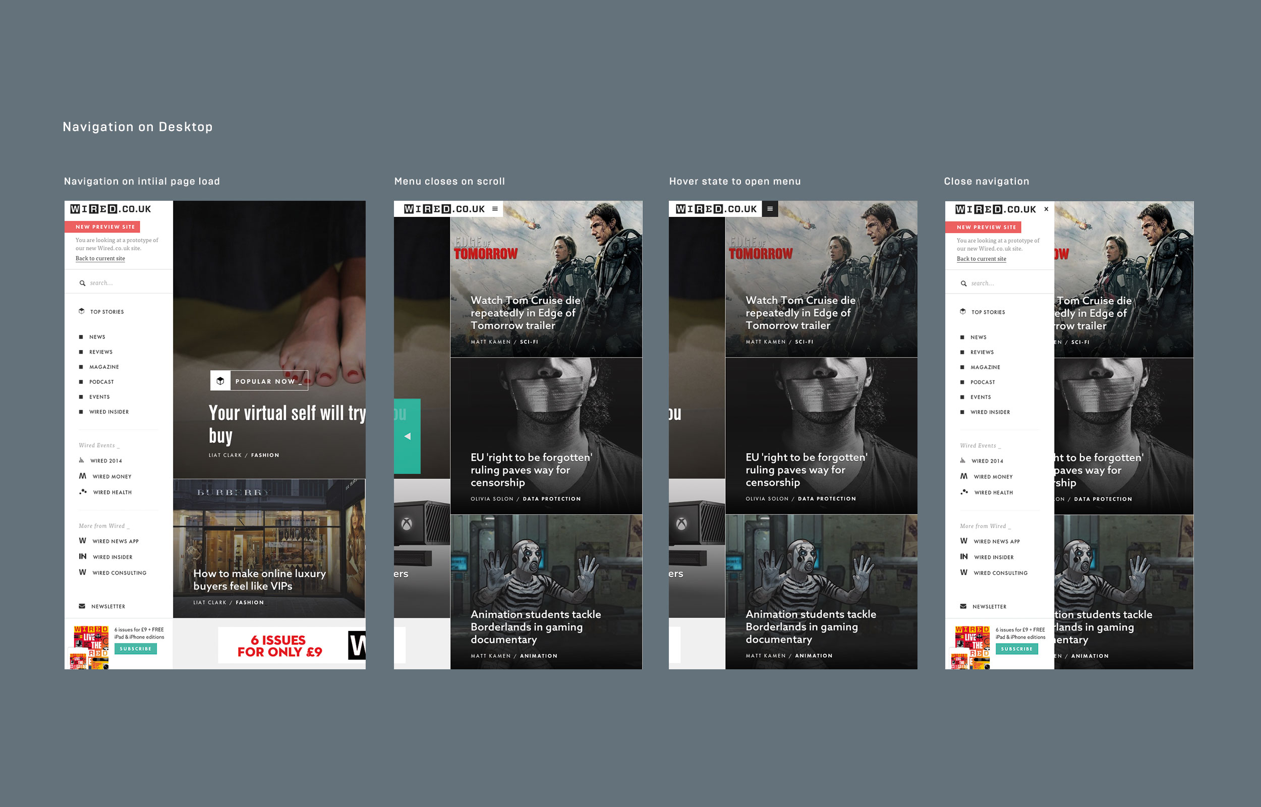
Navigation on desktop
Here you can see how the navigation works on desktop. We wanted the navigation to collapse on scroll, so not to take up space on the page.
Visual language & Layouts
After meeting with various senior stakeholders, such as online editors and art directors we were able to begin the visual process. My intention was always to keep the design clean and impactful, emphasising the popular stories and editors picks by making them larger but still in the flow of the timeline of stories. I differentiated the featured stories even more by making them almost full screen so they have a similar feel to a large magazine feature.
Wired Homepage Demo
Showcasing the homepage functionality.
Some of the design challenges I faced along the way involved making content flow neatly around adverts so the adverts retained their importance but didn't take anything away from the content. We came up with a clean, grid-like structure to differentiate the stories from each other so each one is readable in the timeline of content. Another challenge was getting the images and text to work together on a panel. From the user research into what makes a story appeal to the reader, it confirmed that both the image and the headline are equally important in weight. I decided that having the story headlines overtop of the image connects them together well and keeps each story contained. The challenge was to come up with a design for these panels that worked with such a variety of images.
The design for the menu encompasses the same clean white space used throughout the magazine, to complement the image-led design of the story panels, hopefully keeping it minimal and functional will help the users navigate the site with ease. We took this minimal approach to mobile, stripping back the design of the stories to make it light-weight, functional and readable.
Wired Mobile Demo
Showcasing the homepage functionality on mobile.
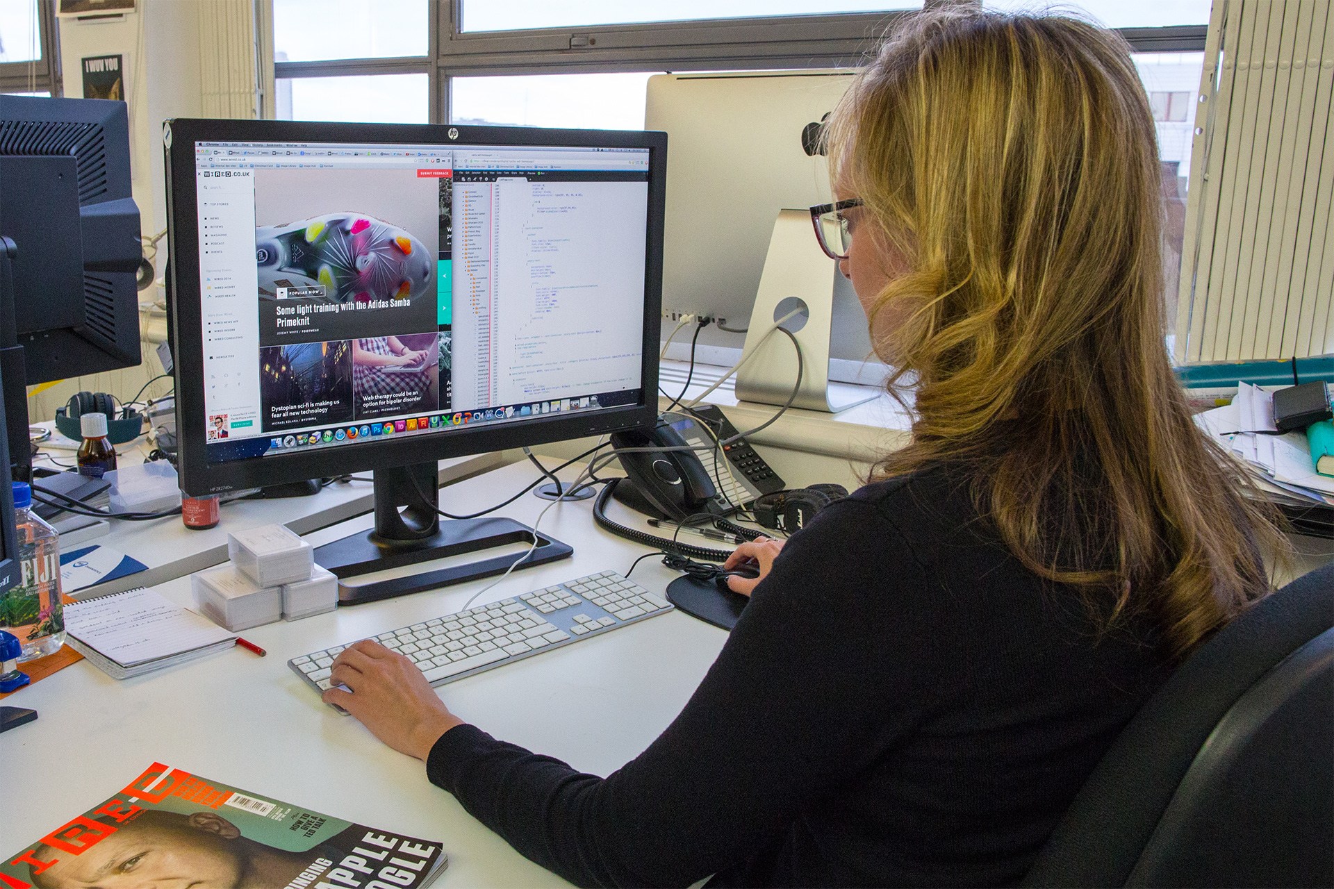
Designing using CSS
After making the initial prototype, I began designing straight into the browser. I was able to quickly apply style changes with real data and test out web fonts easily. This was a new way of working for our team, but one, which I found useful. Understanding the limitations of CSS and SASS, allowed me to see what my designs actually looked like in reality and what was actually feasible. For this I used cloud9, where I was given my own branch and could go in and apply styles to elements to begin to match my designs to what was already built. It was through this project that I began to really understand the capabilities of what I was designing, and how my designs became a reality on screen, but not to mention the control of creating that beautiful end visual.
Designing in the Browser
Using Cloud9 to apply and change the sites visual styles in CSS and SASS.