Miss Vogue
Miss Vogue online is a new microsite to accompany Miss Vogue magazine. With the magazines popularity growing, and other Condé Nast titles having their own online presence, it was paramount that Miss Vogue moved in a similar direction. Here is a case study into my design process and thinking behind the final outcome.
Live Piece, December 2014 - January 2015The Brief
After meeting with various senior stakeholder’s, it was clear that they were keen for Miss Vogue magazine to have its own website. Working as the Lead Designer, and with a deadline of just 6 weeks for design, development and testing, I knew this proved challenging. There were a few requirements outlined in the brief; it must be fully responsive, imagery was to remain at the forefront, and the site must be shareable. Miss Vogue already had a large social media gathering, but they wanted this to continue by linking the site back to the Vogue.co.uk website, where popularity was even higher. They wanted to site to feel youthful and to have a kind of scrapbook feel. Like all Condé Nast websites, integrating adverts was also a must, as this would become Miss Vogues primary revenue stream.
Grids and Layouts
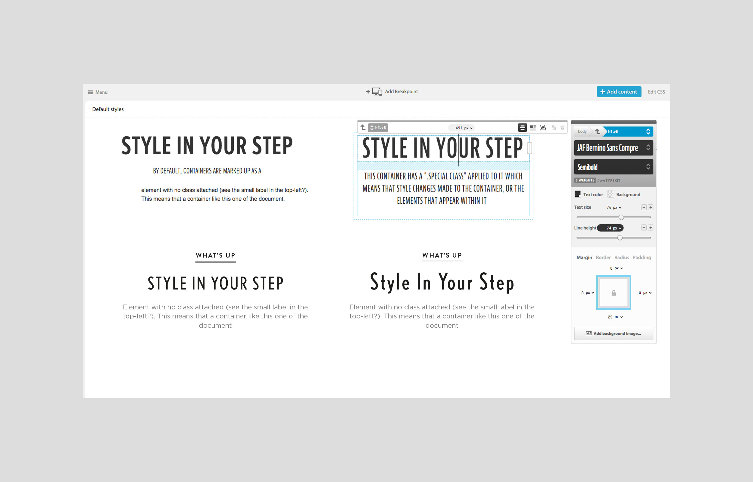
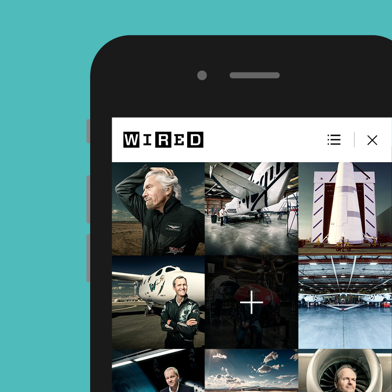
This project had a very tight deadline, with only 2 weeks to wireframe and produce designs of the homepage, list, article and gallery pages. With this in mind I had to quickly come up with a couple of ideas that I thought may work well. I knew that the imagery was to take precedence. This lead me back to Wired homepage where we compiled a grid of imagery rather than a more regimented, image and text layout. I had seen similar websites, like MySpace and The Next Web use a similar grid structure, and thought it was really engaging, and could work well for Miss Vogue.
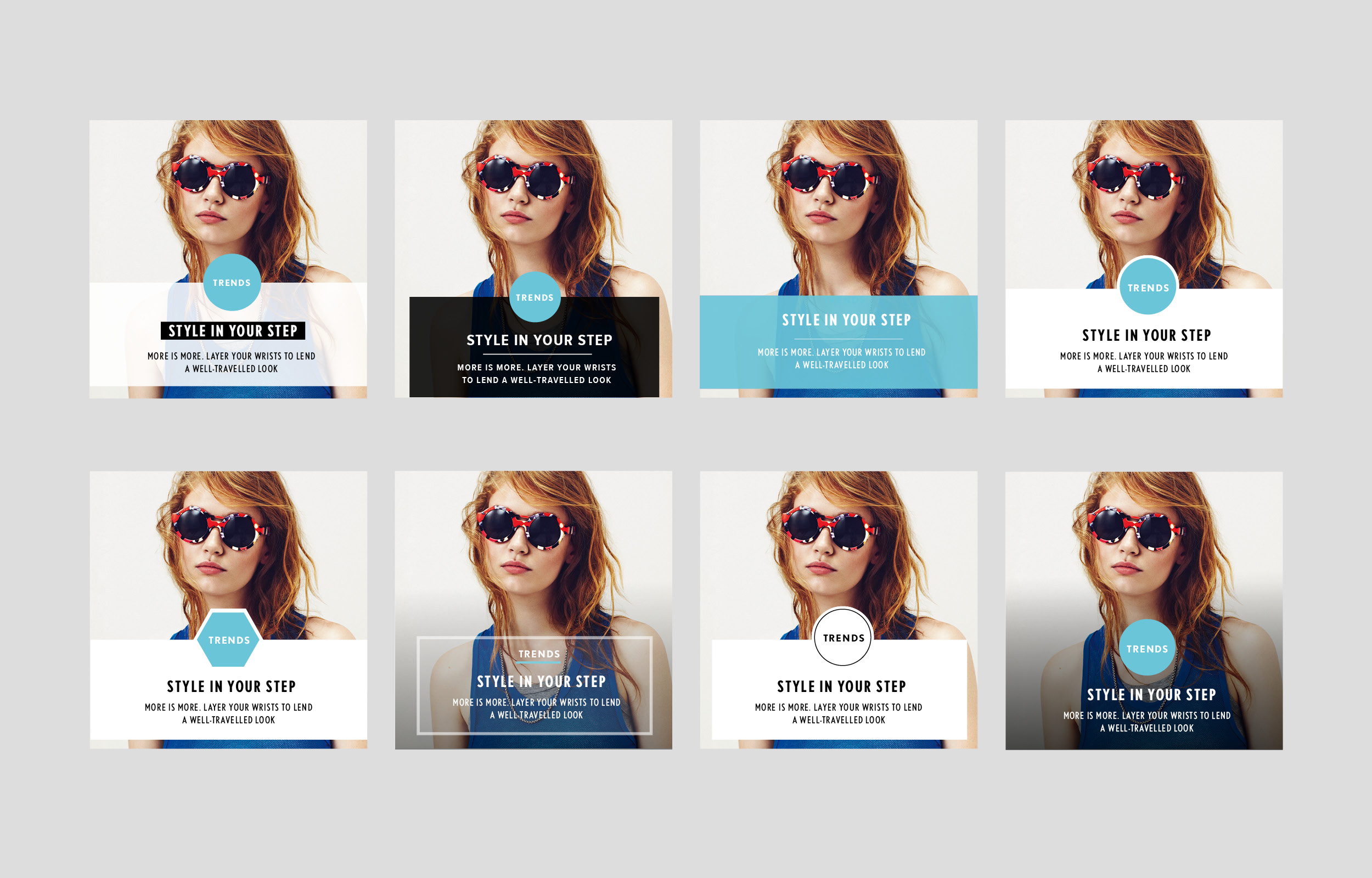
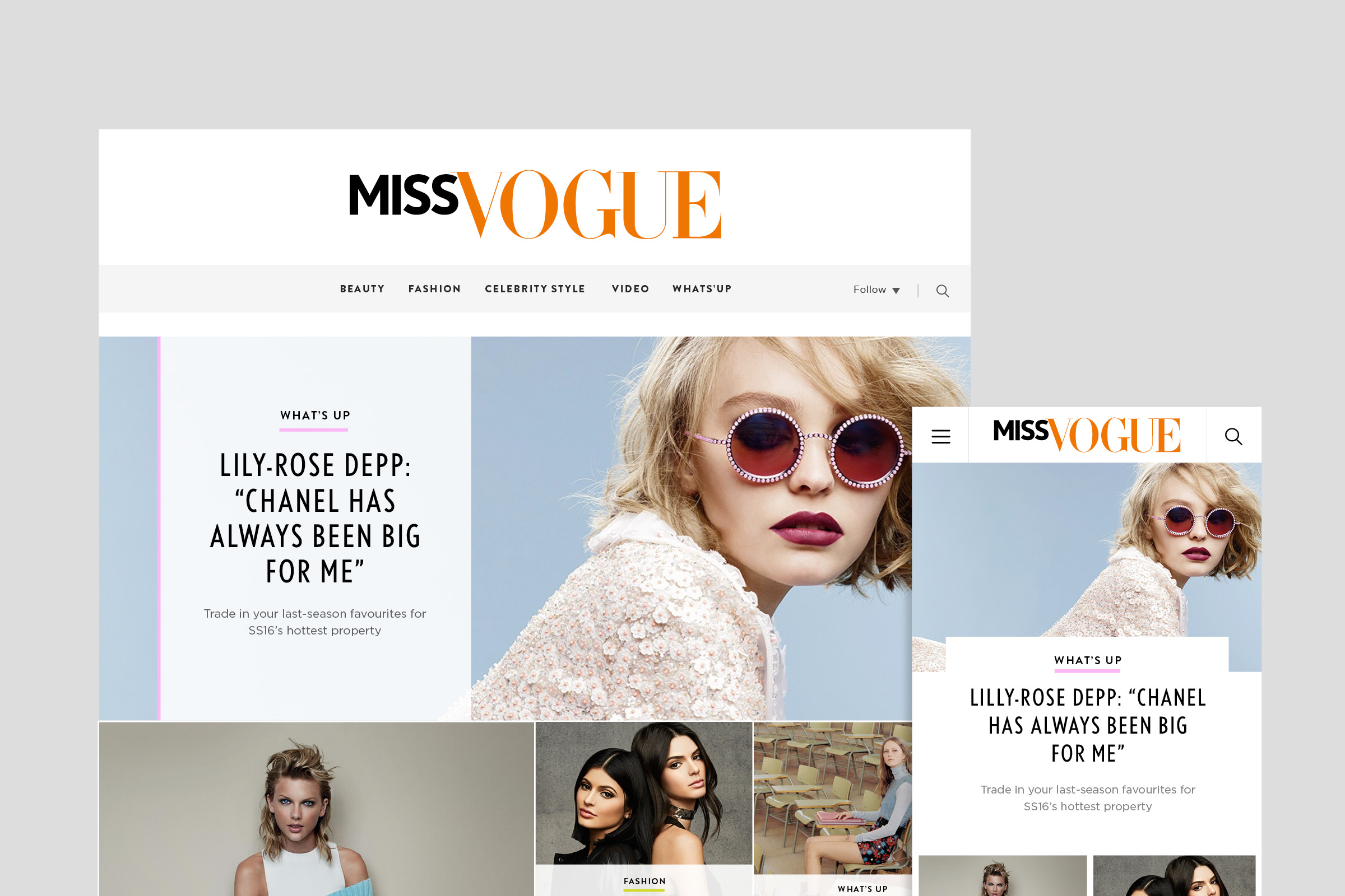
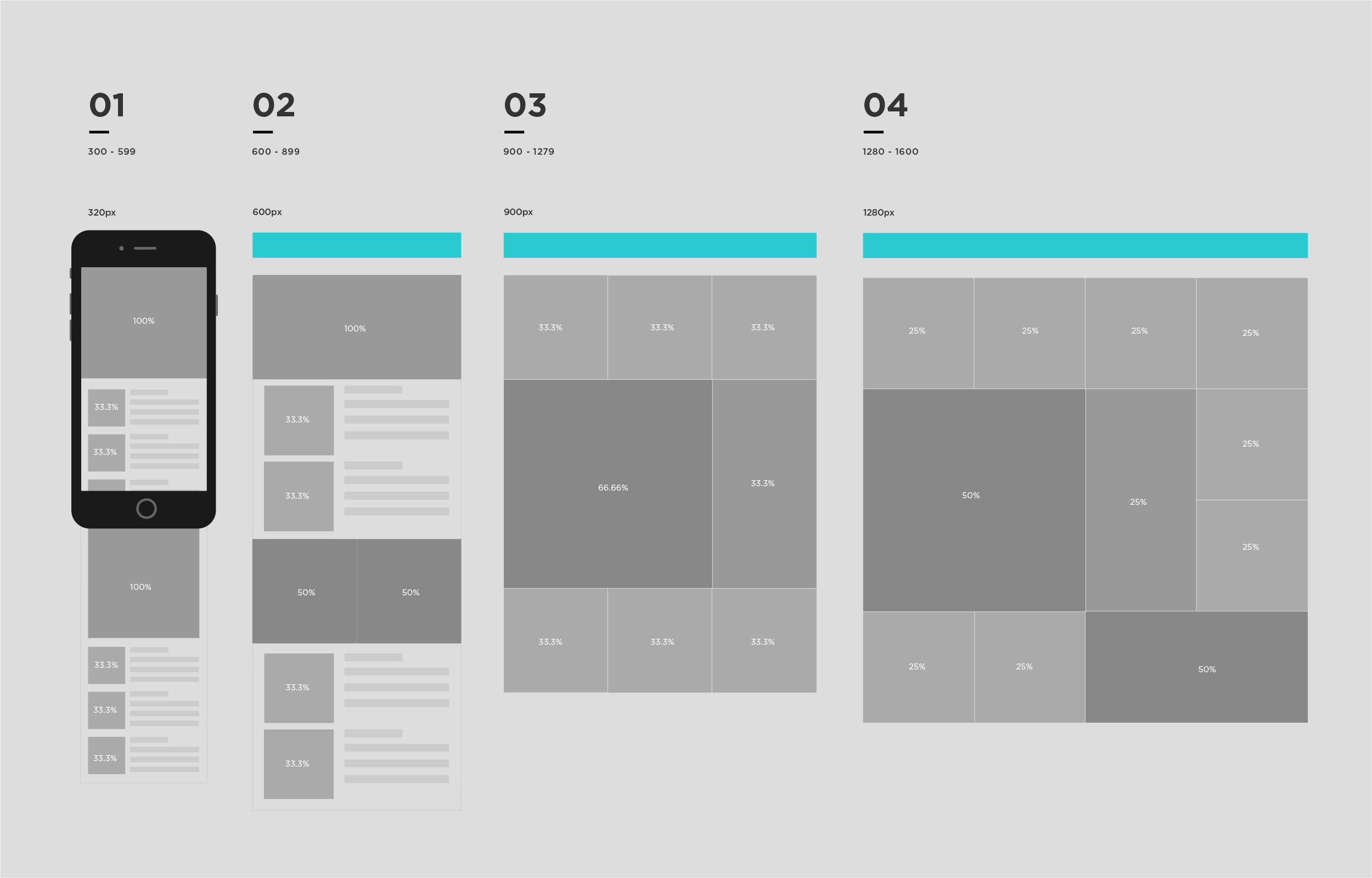
During our initial stakeholder meetings, they expressed their needs to pin popular stories to the top of the page. They wanted editors picks to appear different to regular stories, and for galleries to have a separate treatment. I started by splitting up the page using percentages, applying a 25% width for regular stories and 50% width for others that were of higher hierarchical importance. I wanted each story to sit side by side, with minimal space between each card. I also wanted the layout to feel quite discoverable, like a collage of information as opposed to a structured layout that appeared to be quite formal. It was important that the layout seemed fun, and with Miss Vogues youthful user base in mind. I worked closely with the projects in-house developer, to perfect ideas, and make sure that we were producing wireframes that were achievable. We therefore produced a basic working prototype of the grid to work out breakpoints.
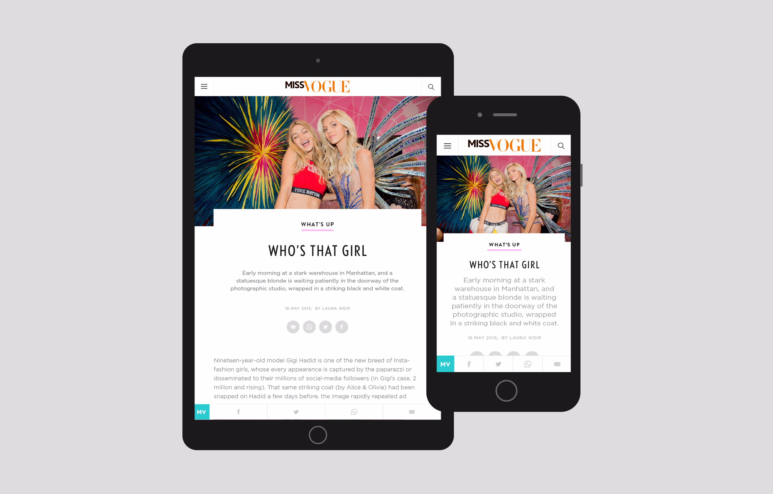
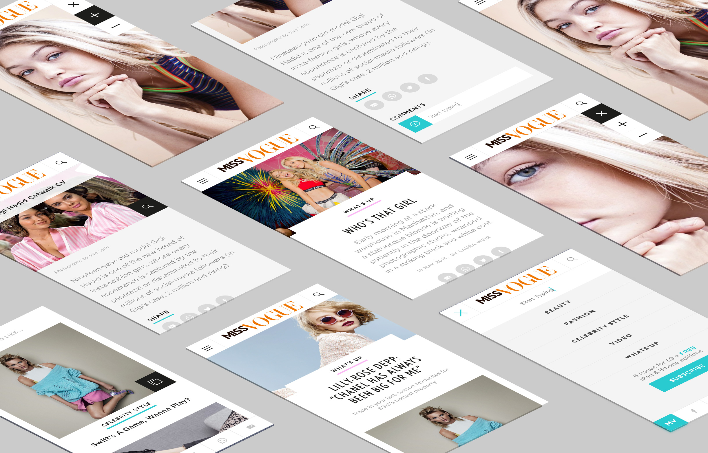
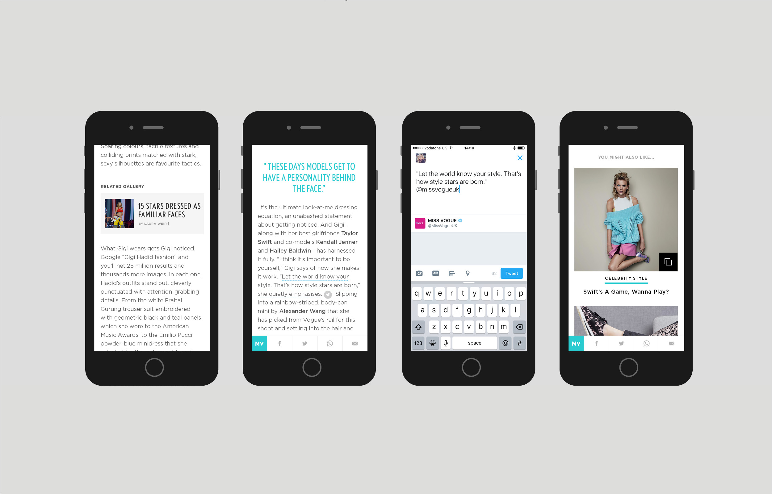
It was important that a user could share content easily. I thought about adding share icons on hover to the cards on the homepage, but thought better of this as I believe you are unlikely to share something just based on title alone. It is traditional of Condé Nast sites to display social icons under the article title. Once a user has scrolled down the page these are then out of view. Another likely place was at the end of the article, again presumptuous as research showed that many users leave an article half way through. I felt like this was a large part of the brief and something that needed more attention. I then started looking at mobile, what if these social icons were presented in a widget that remained fixed at the bottom of the screen, making sharing an article easy and accessible at all times. The design of the social widget needed to be visually subtle and not distract from a users reading experience. Often quotes make interesting content for social sharing, so I included a feature that allowed a user to share a quote or sentence link via twitter. Other interesting features include embedded articles within the content flow, as well as related content at the end of each article.
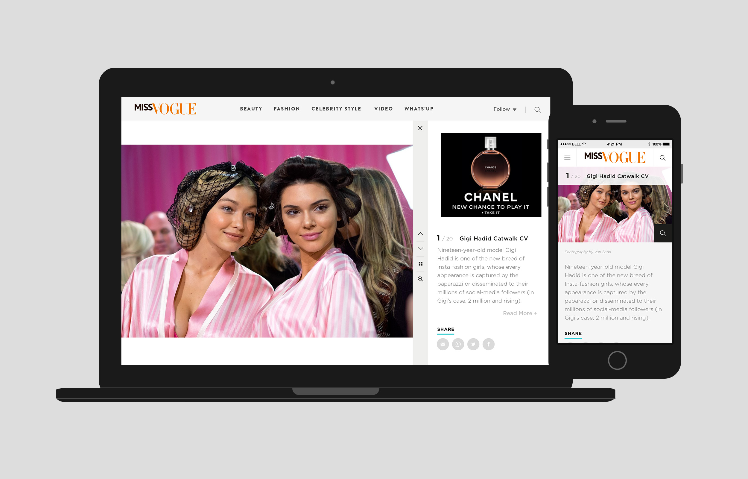
I then began designing the gallery. Initial discussions had highlighted a need for a better experience on mobile, as well as being able to zoom and flick between images with ease. I used InDesign to quickly mock up ideas, looking at how an image would be displayed at different breakpoints. I included real data, like images and descriptions, to get a more accurate perspective of how this may look. I started with the mobile layout, looking at how a user could move between images. I explored many options such as swiping, tapping or iconography to move between images in a gallery. Many of the other Condé Nast sites hide image captions which in turn create an extra step in retrieving all the information. I wanted to find a way that all information was accessible at first glance. This lead me to the idea of just listing gallery images in the same way content was shown on the home and list pages. Scrolling through a gallery was a familiar action and also allowed us to place the image description and social icons neatly under the image. During fashion show season, galleries on Vogue can contain hundreds of images. A lot of the time a user will reach a certain image within the gallery stream through external links. It was therefore important that a user was aware of the total number of images in the gallery as well as knowing their current position. With this in mind we decided to create a fixed bar at the top. This would house both the image number and title, and would change as the next image came into view.