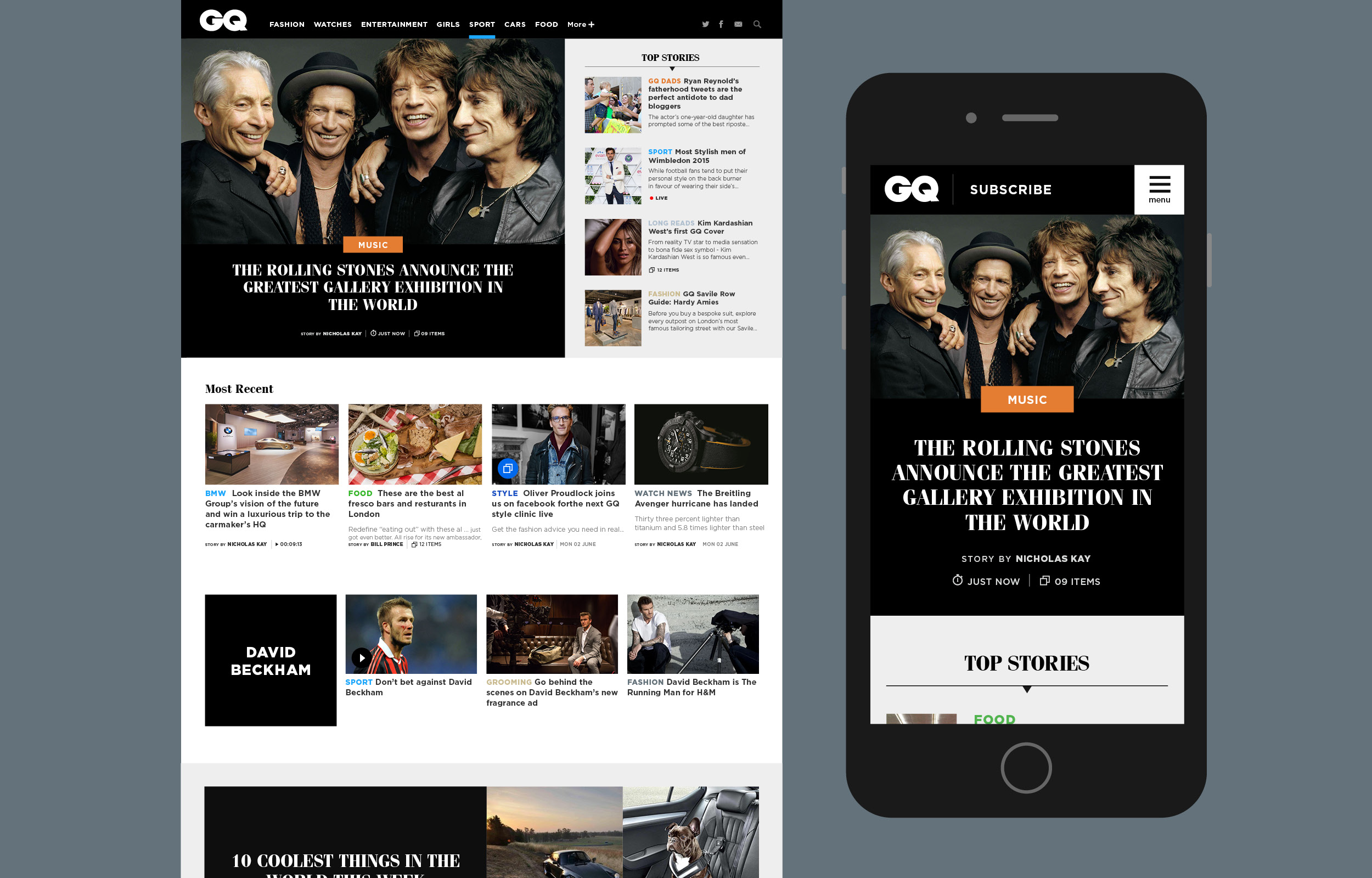
British GQ Mobile First
With the majority of our users wanting to view content on the go, we decided to up our game with a mobile first approach, with the opportunity to capture their growing engagement.
Live Piece, May 2015 – Jan 2016The Brief
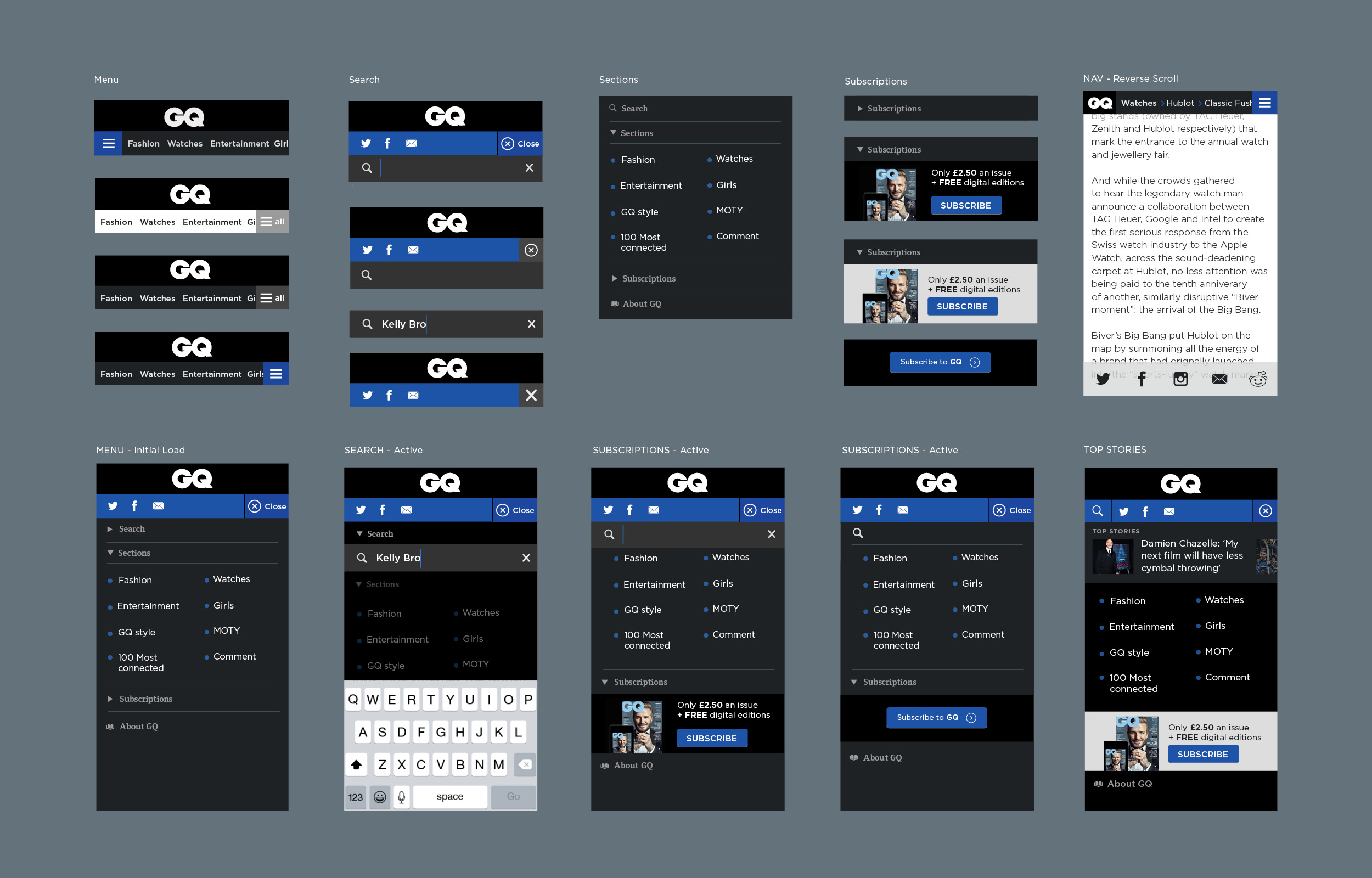
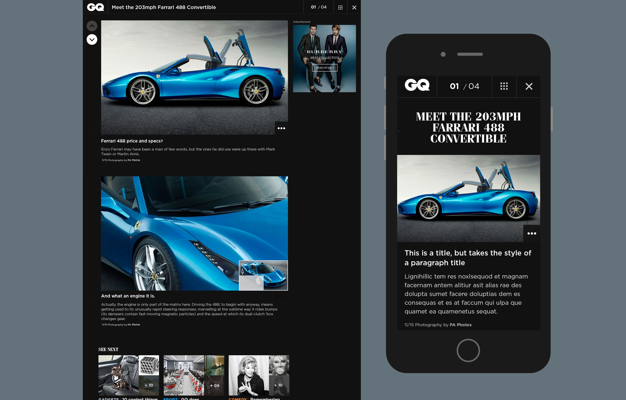
Our aim was to create a template that could be used across all bands and we started with GQ. Some of our objectives being to increase mobile traffic, enhance the sites gallery experience and retain consistent engagement through infinitely scrolling articles. We were also changing the way that the editorial team were uploading content, by running the new site on a new platform and creating a custom CMS. I was responsible for all visual design as well as helping with the UX functionality.
Research & Testing
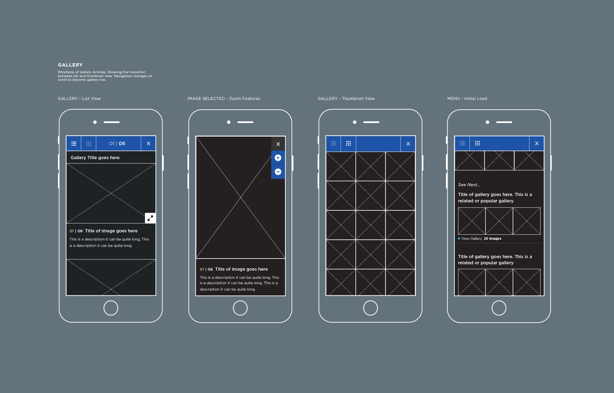
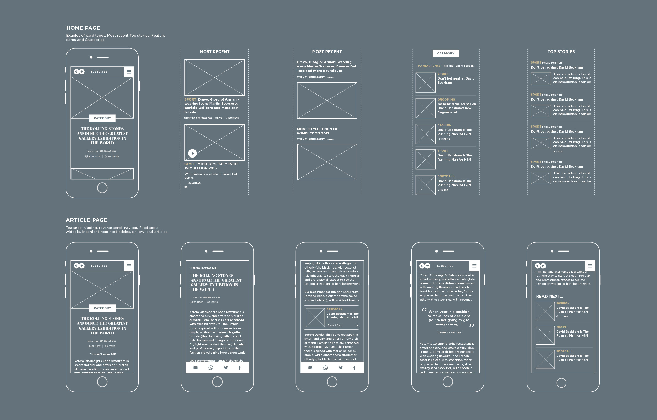
Studies were undertaken by our US titles, which revealed interesting information that many users viewed their publications on mobile and tablet devices. With a mobile first approach to design becoming increasingly popular, and with stats revealing that our mobile traffic was surprisingly under achieving we knew we had to explore this further. A user-testing workshop was created to examine how users interacted with our 4 main titles, Vogue, Wired, Glamour and GQ. We noticed that a lot of people consume information on the go. They preferred short form articles, and the ability to easily scroll and swipe to consume more content. They wanted a better gallery experience allowing them to view thumbnails and skip to images. Editorial content was highly trusted and valued. From this study we began looking at the mobile functionality of our current websites and improving areas that were not performing well.
The Concept
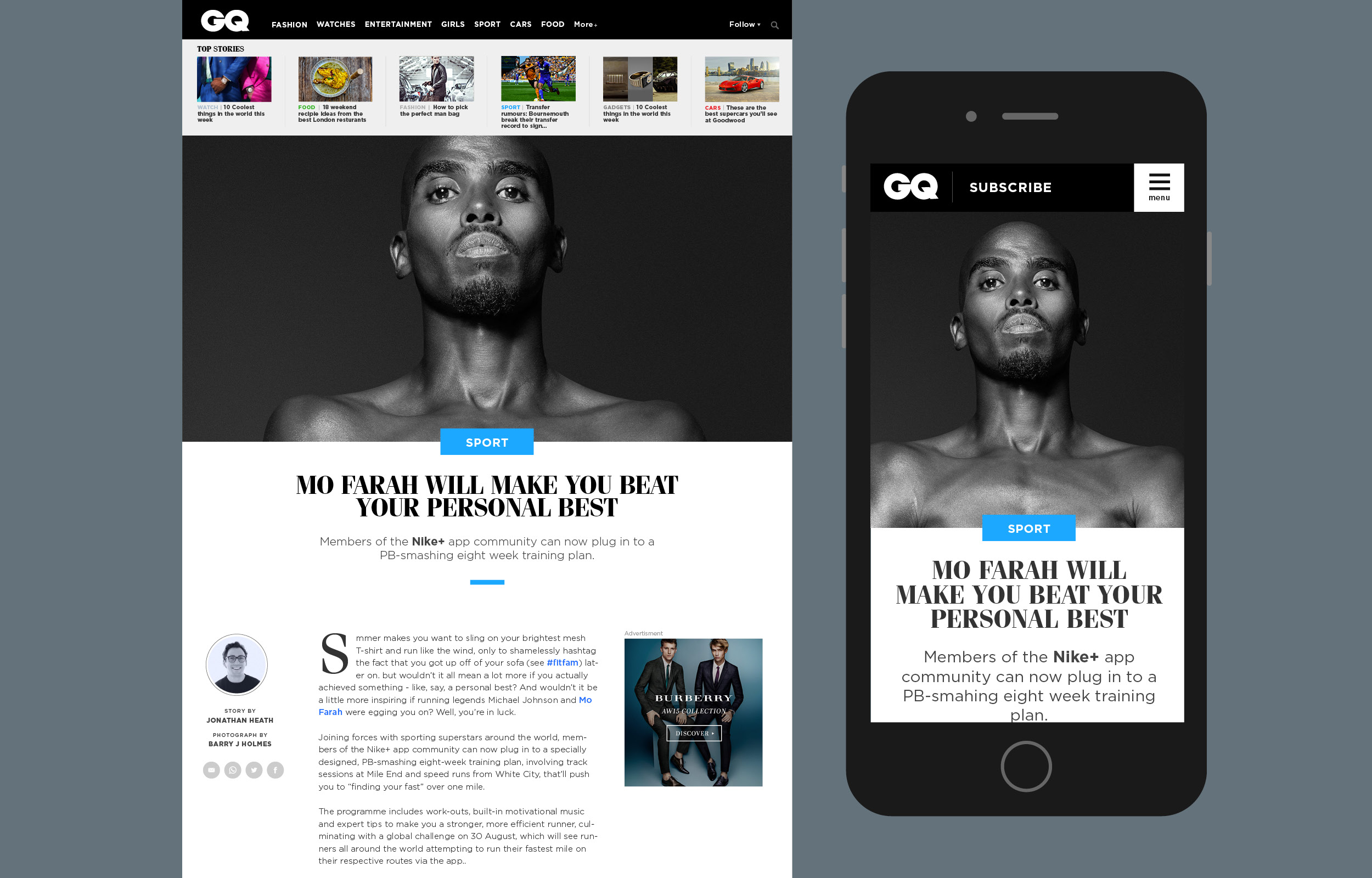
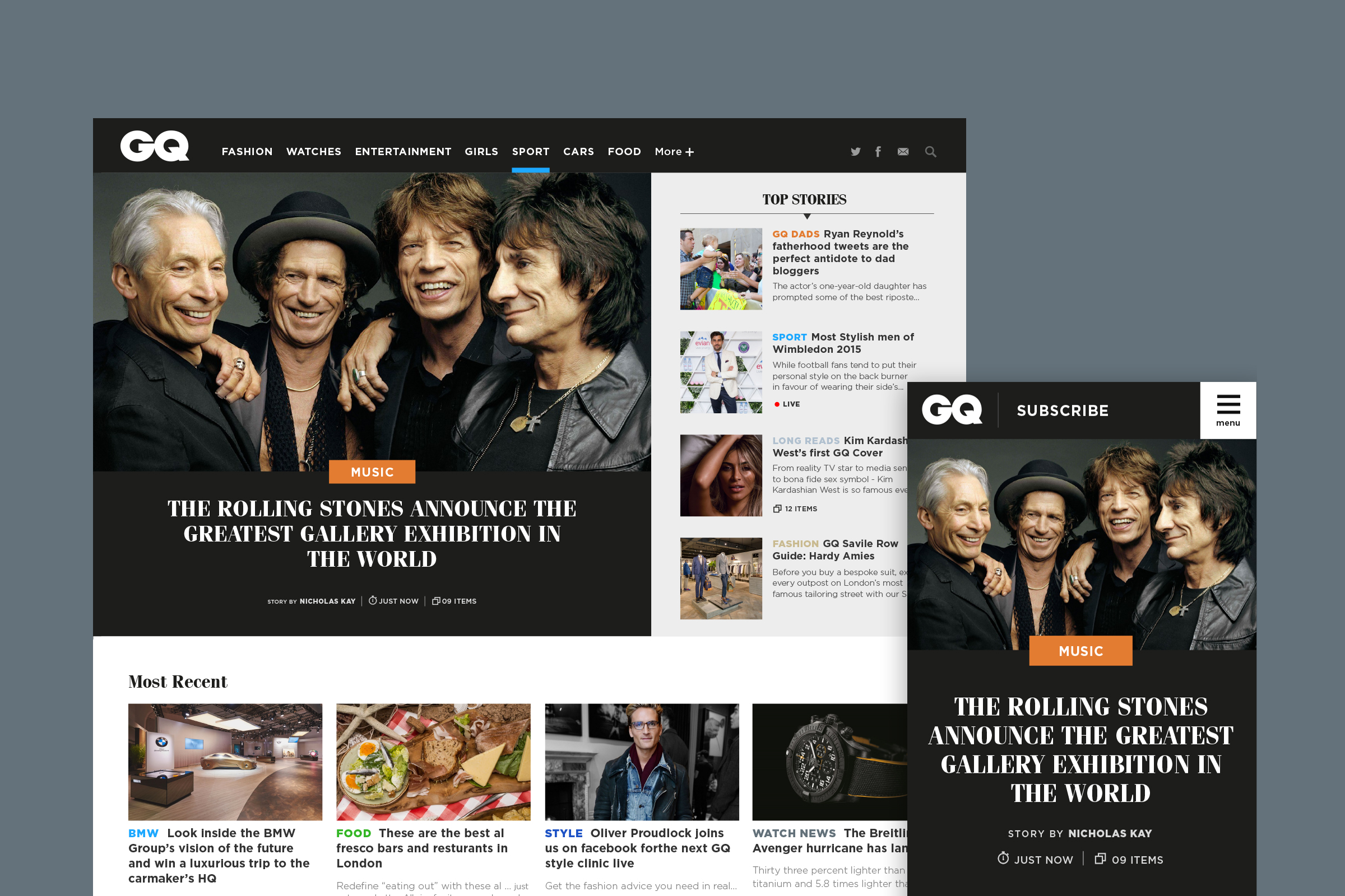
A lot of users discover our sites through external links and therefore land directly in an article. We therefore wanted to keep the user engaged, with recommendations to new content or by infinitely scrolling into the next article or gallery. A lot of content GQ publish is made up of galleries, whether they are products or shows. Being able to switch between a list and thumbnail view was therefore a good feature. We wanted the homepage to feel discoverable and somewhere that users could easily see news. We had the idea to create different sections that could sit anywhere on the page. This would allow mobile content to start with either a feature story or a list of stories. It also meant that editors could choose to reposition content and rename sections as they wish, either by recent content or categories. We wanted ads to feel less intrusive, and feel part of the content flow. With this information to hand I began mocking up wireframes. I used tools such as InVision to easily show stakeholders how they could navigate around the website, and also allow the editors to see if this new approach would work well with the content they write. I explored many different options, from the size of panels on the homepage to the responsive layouts of articles and galleries.