The Scene UK
With video content becoming increasingly popular, my role as Lead Designer was to create a new responsive website, that could host video content produced by the editorial brands. The original idea for the Scene UK was to replicate the Conde Nast US version, which was already proving successful.
Conceptual Piece, Feb - May 2014The Brief
We had recently appointed a new video team who would create content for each of the brands new channels. We therefore needed to produce a fully responsive website that could host this new video content. The business model relied heavily on advertising as its main revenue stream. I began by meeting with the acting heads of both digital and video to map out how we wanted the site to function and what pages and information was important.
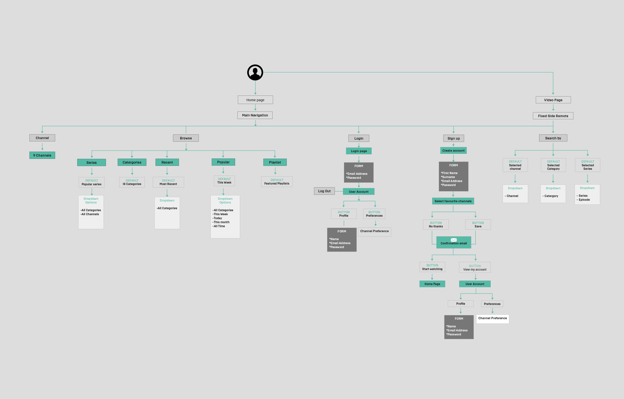
As a team we had to decide how we would integrate the video platform into what we were going to build. Did we want to host content though YouTube or produce something ourselves? I began by putting together a site map. It was important for me to know all the sections and pages that I would be producing wireframes for, so a site map was a brilliant way of working out basic site functionality and links between pages.
Responsive Grids & Layouts
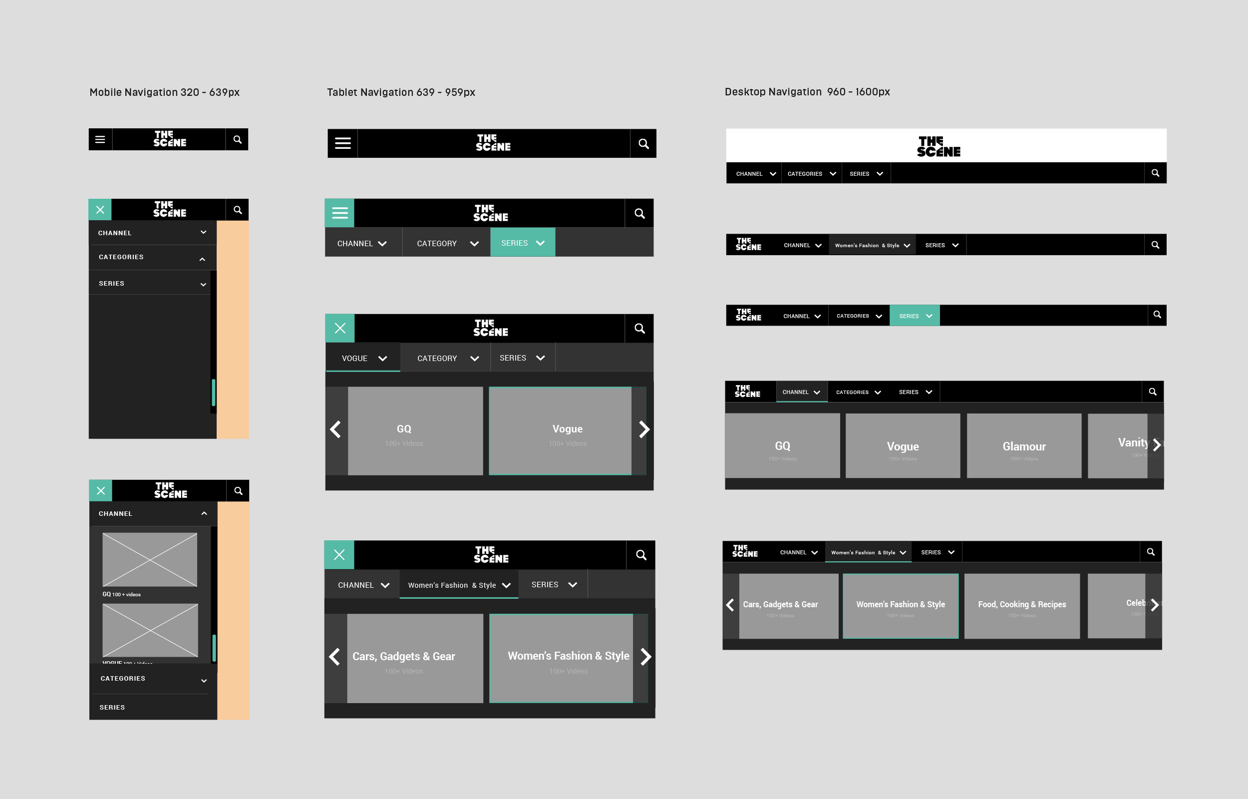
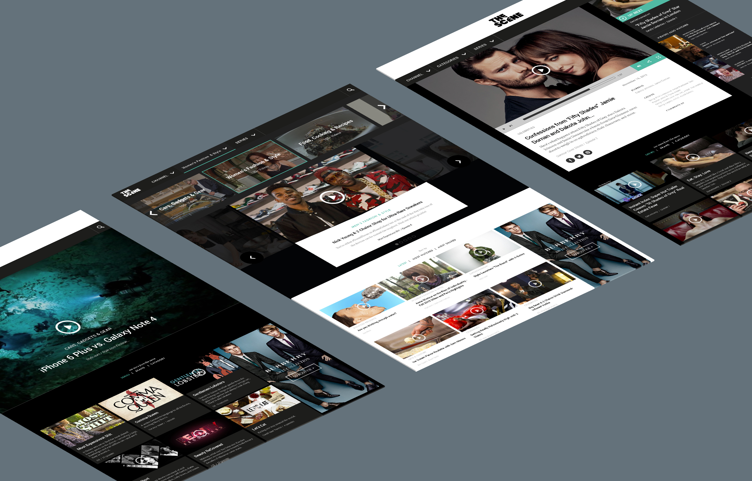
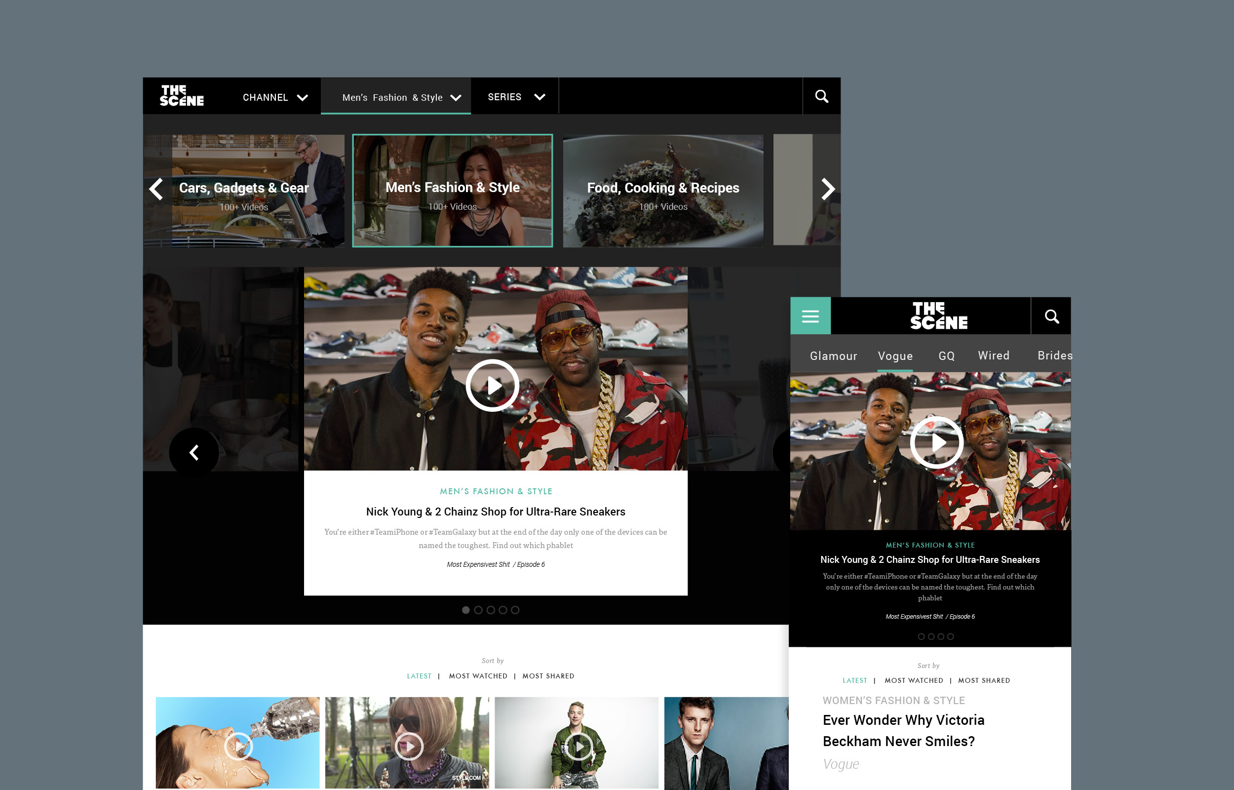
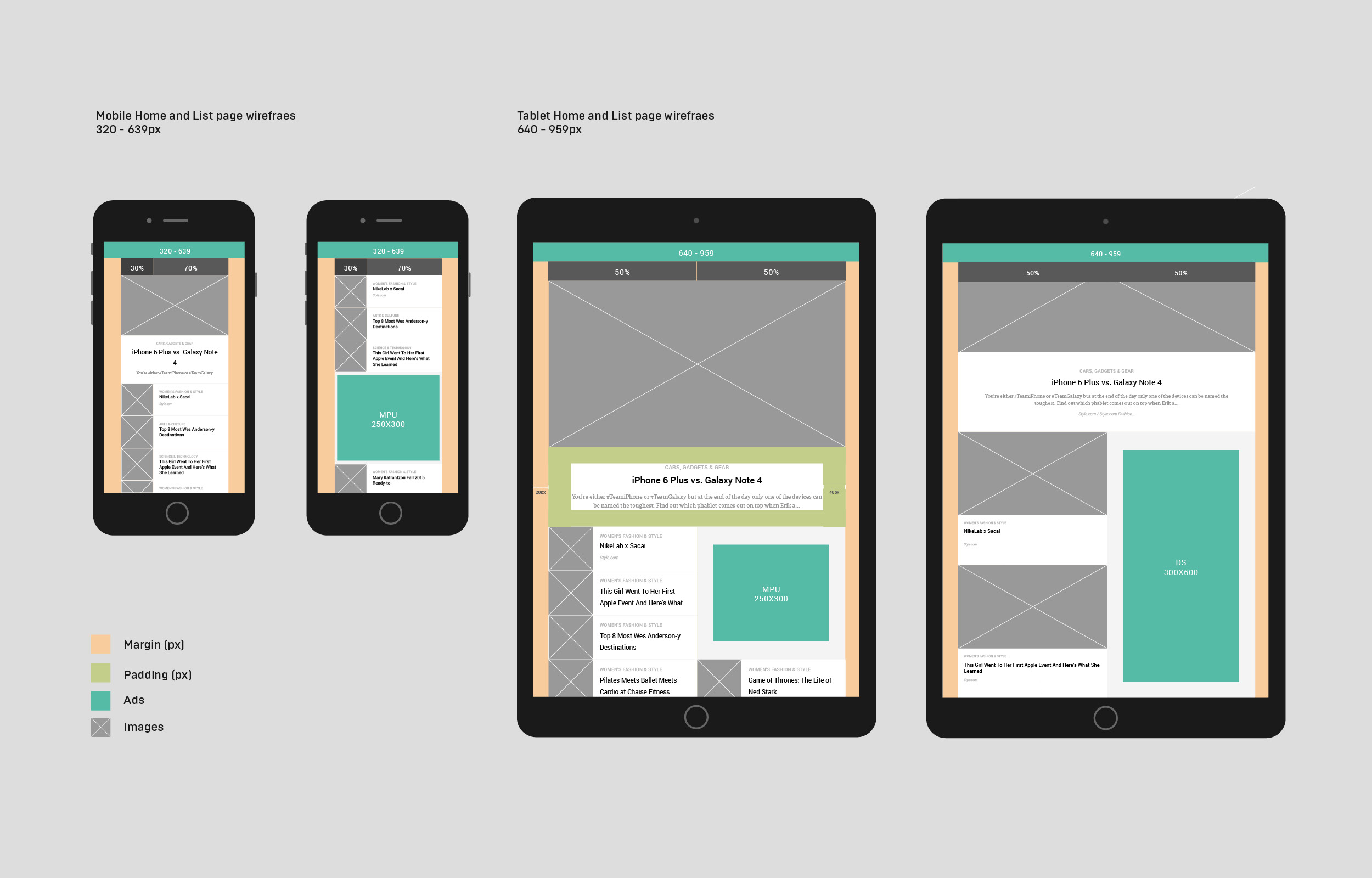
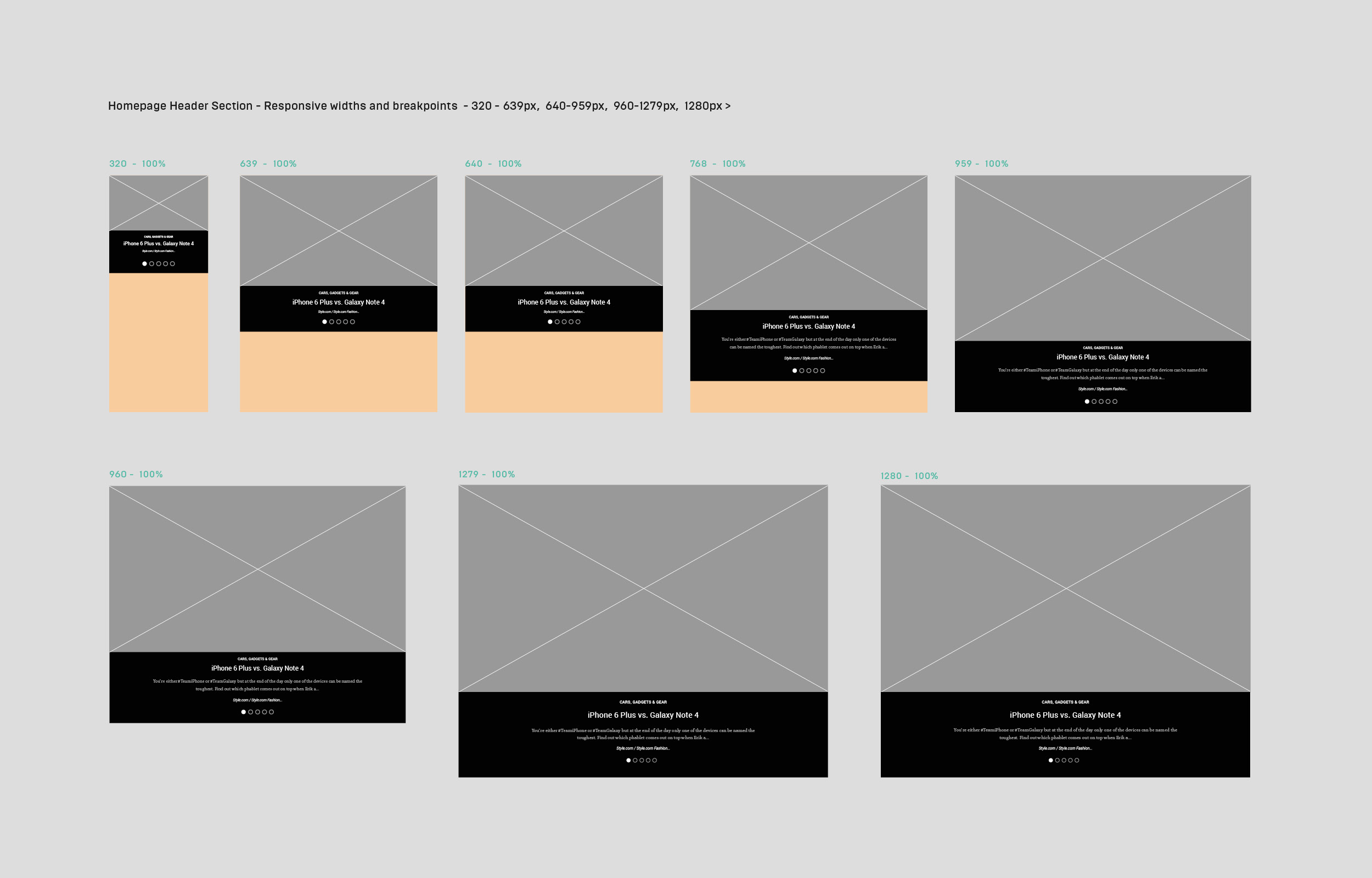
It was important that viewing video content on mobile and tablet devices was functional from a UX perspective. Research had shown us that a lot of video content was consumed via mobile devices, so this had to become a priority. Also with MPU and DS adverts being a minimum width of 300px, I knew this would heavily impact the grid structure I would choose. I began mocking up wireframes in InDesign, using percentages rather than pixels. From this I was able to easily work out my breakpoints between devices. Once these breakpoints were in place I started to experiment with different layouts, splitting columns down even further if needed. I included margins and padding to each element, so I could adjust space around a particular section. This information was important during the development stage and also a great reference that could be easily adapted further along in the design phase. The same grid layout was also used across the site where possible to show consistency between different types of content.
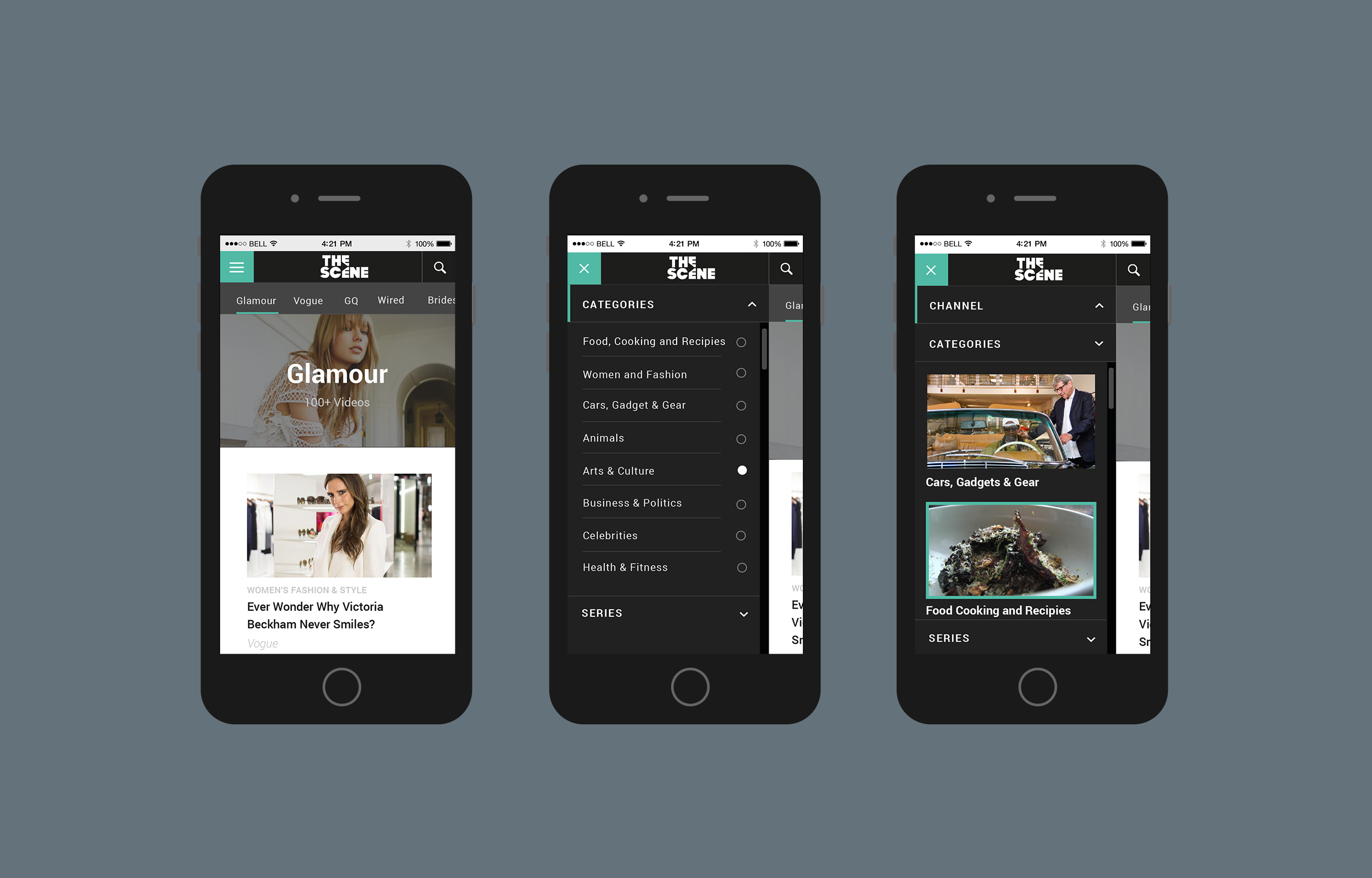
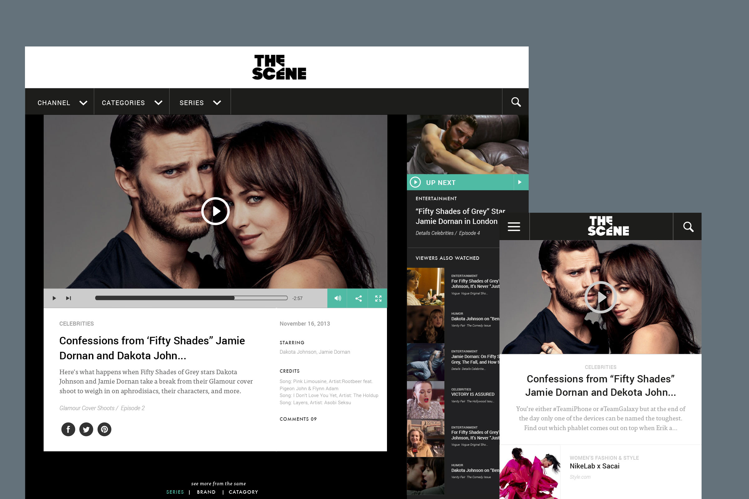
I began looking at the sites navigation, we wanted the user to be able to discover content through three main avenues; brand, category and/or series. A series would also contain different episodes. The sub navigation would then change as the user selected their choice. For example, Brand > Category > Series could become Vogue > Fashion > Vogue Fashion Week. By highlighting the section change in the menu area a user could be clear on their choice, and go back and review if necessary. This theory also worked really well on mobile, however we took a slightly different approach. Here we produced a side scroll sub navigation, the idea being to allow quick access to each brand. Once a user chose a brand, they would then narrow down their search, selecting a category or series.
Each page result was also broken down further, into latest, most watched and most shared. I didn’t want this information to sit inside the navigation, as not all sections would display these other options. Instead I created a sort of sub navigation, located at the top of each page, giving a user the option to narrow down their search even further.
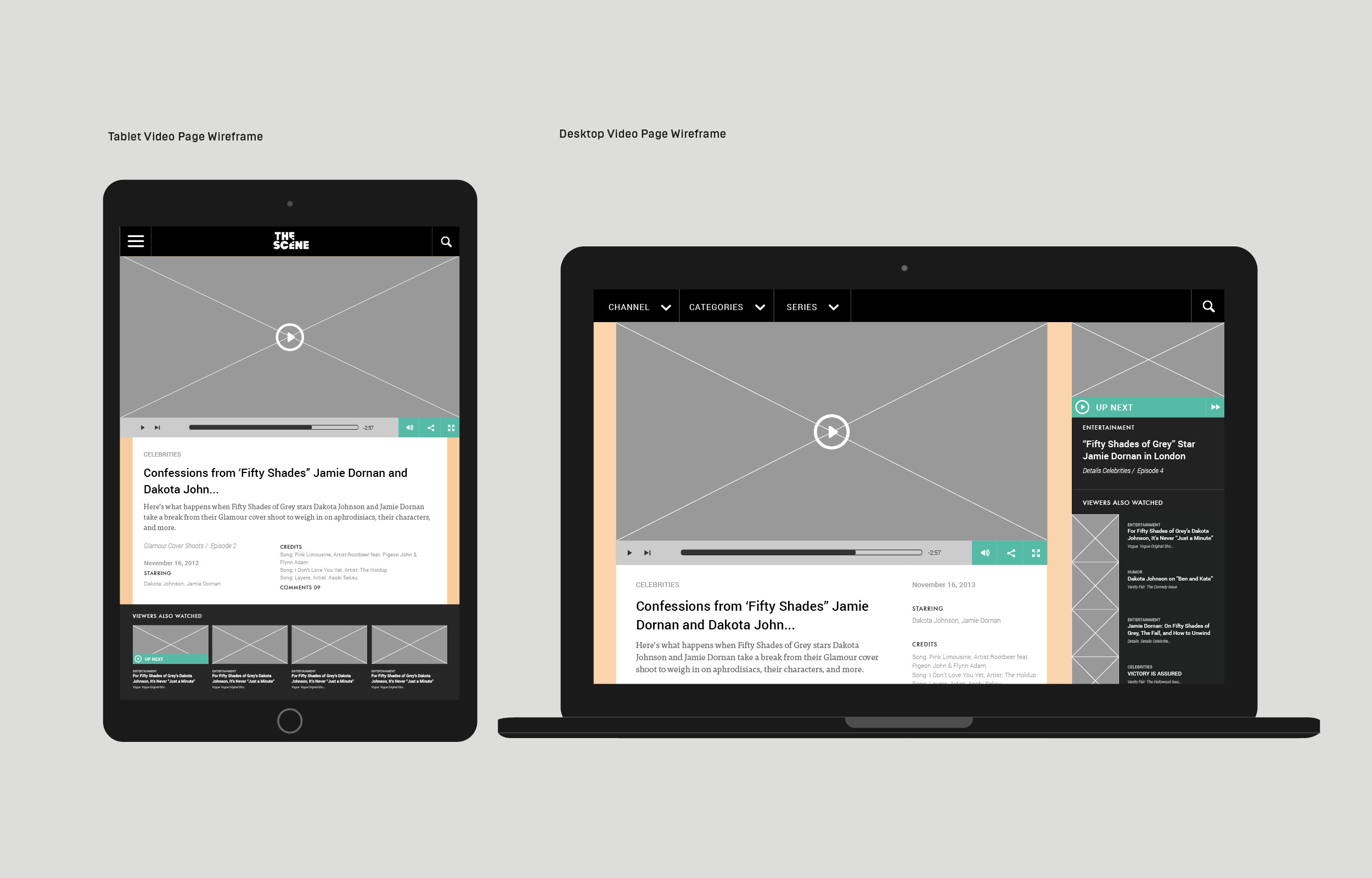
Having the option to select the next episode within a series was important in allowing the user to engage quickly with new content. With this in mind I introduced a panel to the right of the main playing video. Here you could find a list of other episodes in each series, as well as all related series or other similar/popular content.
When scrolling content the navigation bar was to remain fixed to the top. This is particularly helpful when trying to locate different episodes within a series. We knew that often a user would land on a video page via an external link, so being able to access the menu at all times was beneficial.