Wired mobile header

Wired UK Mobile First


Our next challenge was to roll out the mobile first concept across all Condé Nast online publications. We started with Wired UK.

Live Piece, November 2015 – May 2016

The Brief


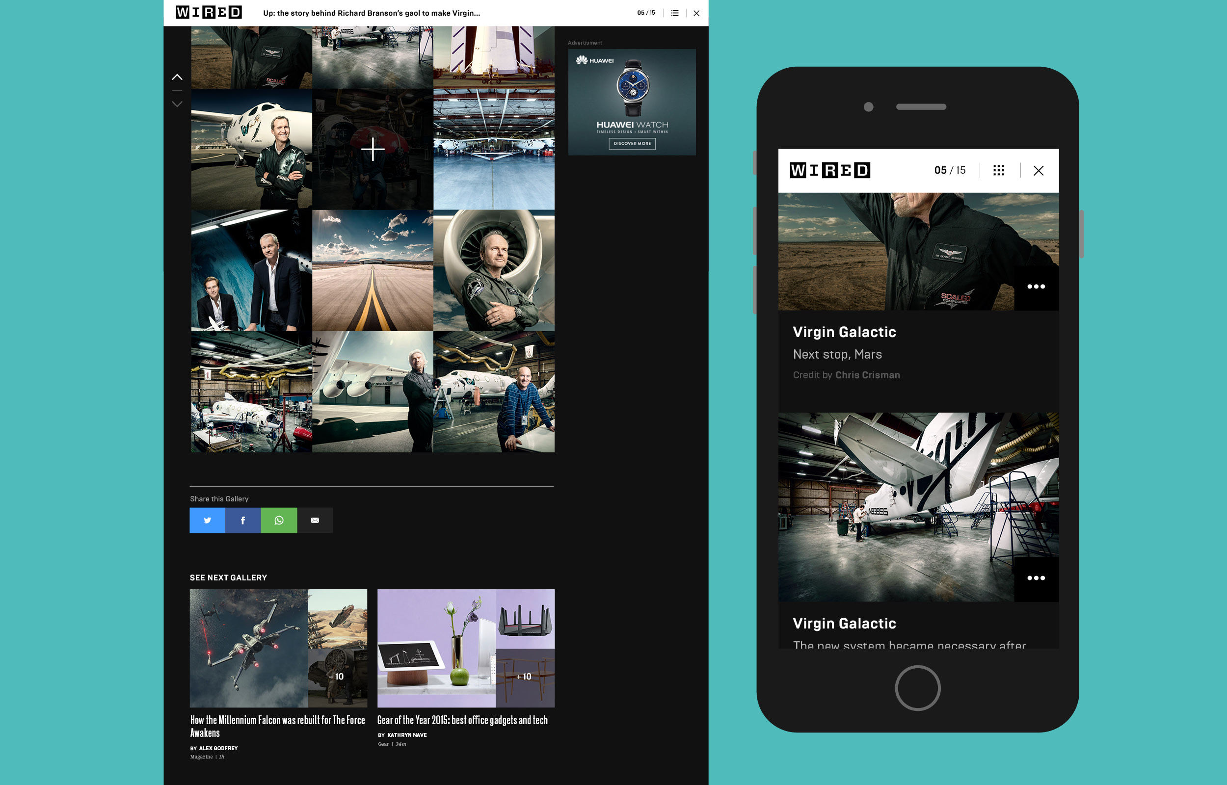
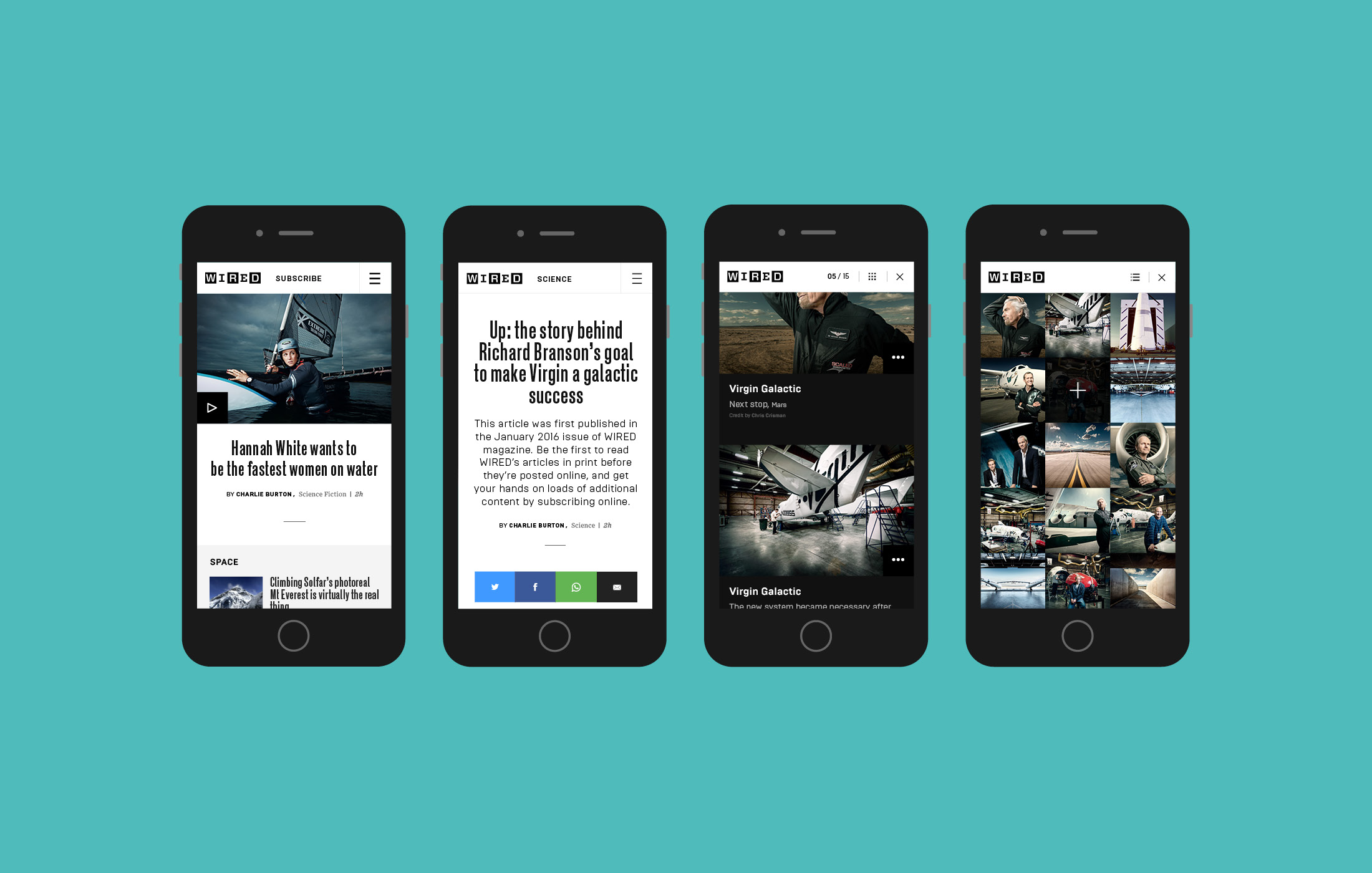
During the initial usability testing sessions completed for GQ, we also gathered valuable feedback on Wired, Vogue and Glamour. Wired users again wanted a mobile centred site. They were very image lead and wanted to browse quickly through a clean layout with concise titles. A lot of users visited the site for product reviews, user comments and product galleries. During user focus groups they had expressed their concern over a lack of gallery content and how the gallery experience on mobile was poor.

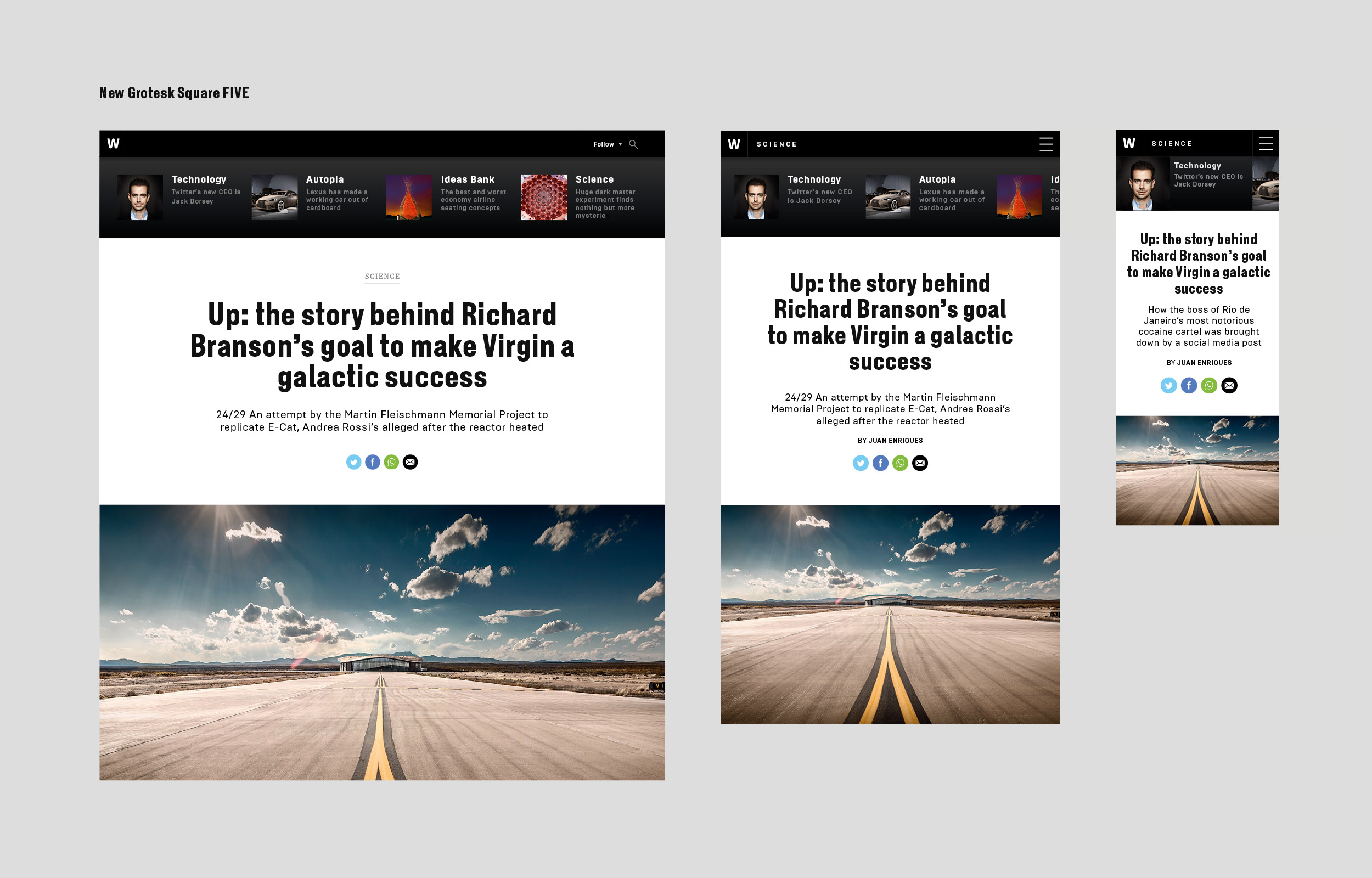
The main focus was to keep the HTML structure for both GQ and Wired the same, but create a visual divide by changing CSS elements. Wired has very different content to GQ, so adapting the template to include sections like reviews and podcasts would be important.

Grids & Layouts


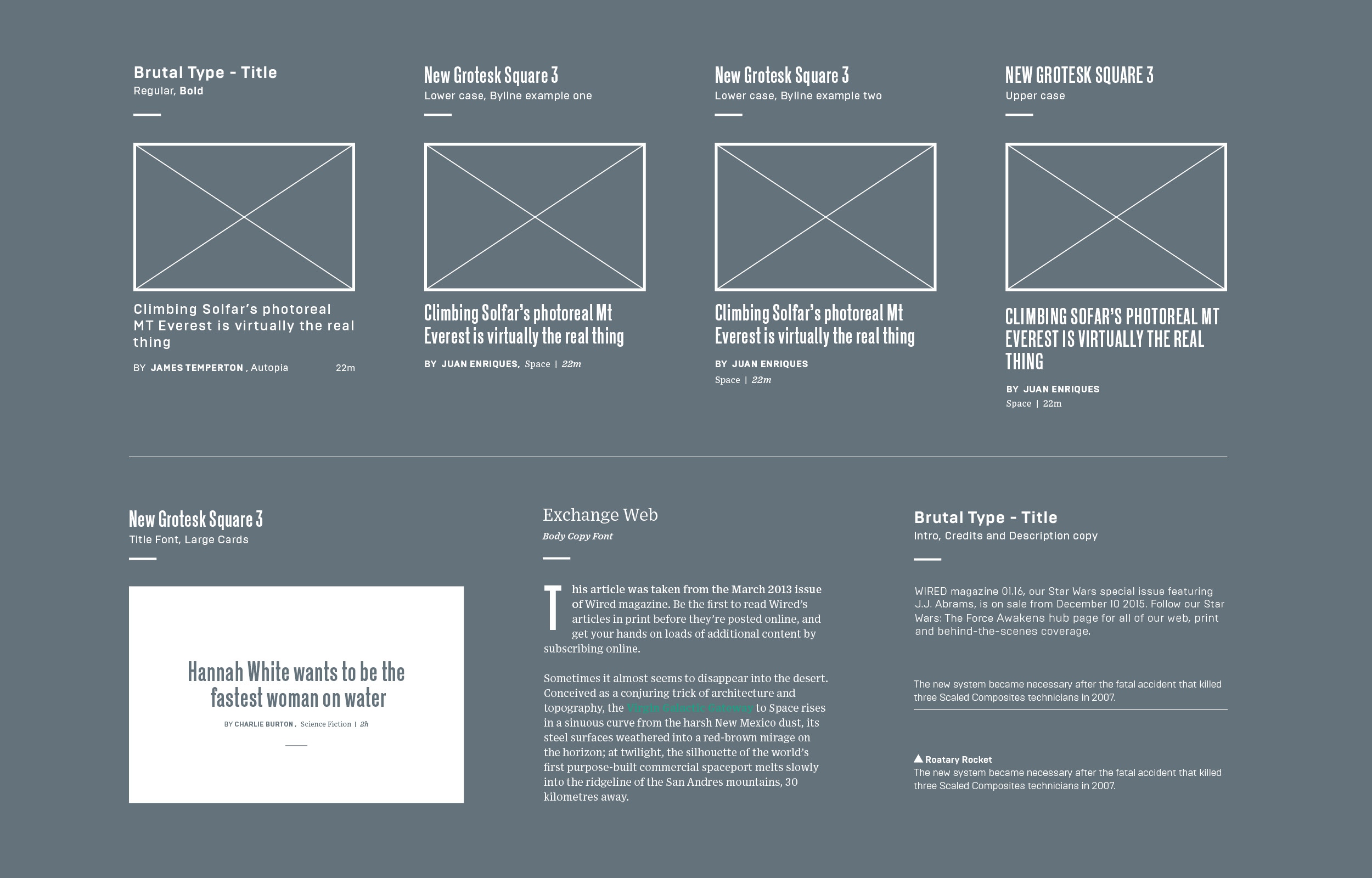
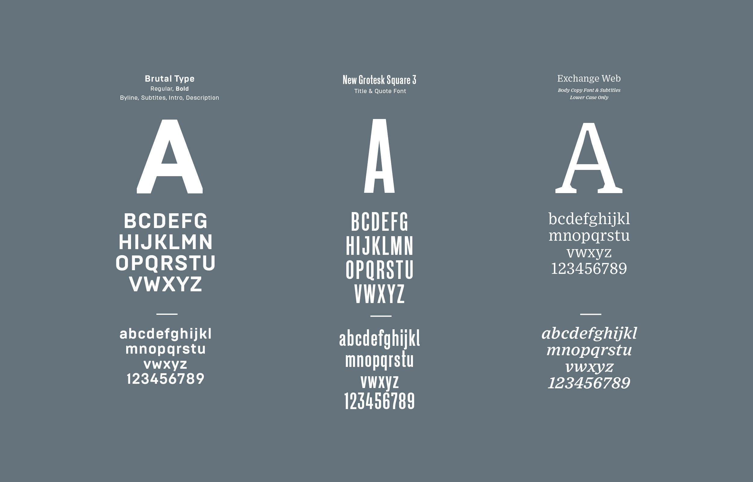
I began by meeting with Wired UK Creative Director, Andrew Diprose. We introduced him to GQ’s new rebrand, giving him an insight into the sites improvements but also structural restrictions that may be applied to Wired. Andrew’s main concern was whether or not we could use the new clean design of the magazine and apply this successfully across all digital platforms. It is sometimes quite difficult when designing responsive sites to create something so exact that it has the capability to remain that way over several screen widths. I knew that we could achieve the visual consistency through spacing of elements, typography and image layouts, but would this be enough? Would the regimented grid structure of the magazine transfer well online?

With a Wired magazine to hand for inspiration, I began updating the existing GQ template, taking typography, iconography and general layout into consideration. We wanted to remove the original header section on the homepage, and start the site with a clean line of story content. I also had to include two new sections in the page layout, these being reviews and podcasts. After updating the gallery and article pages it was time to review things again, and work on visual styling in more detail. I worked closely with the team’s front-end developer during this stage, to make sure the changes and inclusion of new sections was possible.

wireframes & styles Examples of standard story cards, experimenting with title styles.
Invision Prototype Prototype, used as a conceptual demo. Showcasing different card styles on the homepage, article and gallery pages.
Full width ads Both GQ and Wired websites incorporate the new full width responsive ads on the homepage.

Visual Design


It is always important to establish constancy between the magazine and the digital platforms. Andrew wanted to carry over the more mature look of the newly designed magazine. Wired has a very design–conscious audience, so it was important that the design mirrored the content. The new grid layout was also a key feature, with more columns and floating content. I was to take these elements and make them fit with the already existing mobile first framework.

Visual Language Typeface variations.

Other than the grid, typography was to play a huge part in the design process. With Wired having produced new typefaces for section headings and paragraph type, it was important that the website followed the same path. Beckett was one of Wired UK's newest typeface additions, but when mocked up as web content this font did not carry the same feel. Primarily we needed fonts that could be versatile. I mocked up a few variations of each slice of the homepage, using different fonts and weights. With Andrew’s guidance we were able to see whether a font was adaptable, legible and carried the right look and feel online. Keeping font options to a minimum was also important for the sites overall performance. We went trough each type set, eliminating weights and only keeping what was absolutely necessary.

Experimenting with heading font options for the article pages. Here is one of Wired UK's signature typefaces, New Grotesk Square.
Article Page Design Final Design of the article page on desktop and mobile.

Once a selection of typefaces had been chosen, it was time to apply these styles across the site. Often we would review and change our decisions, until it was right. Using InVision I was able to make a mobile prototype, to give a better insight of the final product. From this we could review sections that were not working visually, like the navigation and parts of the article page, and rectify them.

I wanted the website to follow the magazines clean and mature new look. I used different weight lines to form breaks and separate content, thus creating a clear grid. Everything was kept minimalistic, using only black and white. The precise and accurate use of space between different elements also helped to achieve a more formal feel. Having designed GQ, I was really aware of the difficulties each page brought, and was able to quickly resolve any visual issues. Although the framework of both sites are similar, each visual representation has allowed the brands to remain separate and true to their own individual style.

Desktop Gallery Examples of the thumbnail vs. list view layouts.
Mobile & gallery layout Home, article and gallery page examples on mobile.

Next project